Good To Know
There are some DynaMaker basic concepts that are good to know beforehand. Although they are not mandatory to learn before the tutorials, they will help you to understand them faster. But don't worry they will be referenced many times throughout them. If you are completely new into programming and DynaMaker, this is your place! The concepts that are reviewed here are:
- Developer account
- Dashboard
- App structure
- Web browser
- Language: TypeScript
- DynaMaker code editors
- DynaMaker libraries
- Keyboard shortcuts
Developer Account
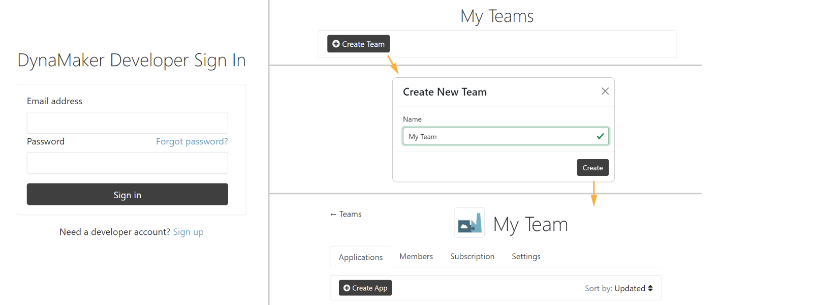
Once you have created an account at app.dynamaker.com/register, you can create your own teams and be a member of other's at the same time.
Dashboard
If you go into your team, you will see all the apps that you have created in the team. Then there are 2 dashboards:
Team Dashboard
When you go into one of your teams, you find the following:
Here are the main features of your team dashboard, starting from top-left counter-clockwise:
- Create a new app with the button + Create App.
- Open the app dashboard by clicking the thumbnail or its name.
- Check when the project was created and last updated via the timestamps.
- Fork (make a copy) and delete the app via ⚙️.
- Sort the project list in different ways.
Within each team, you can create all the apps you want in Applications, invite your colleagues to your team in Members, review your DynaMaker Subscription and more.
Members
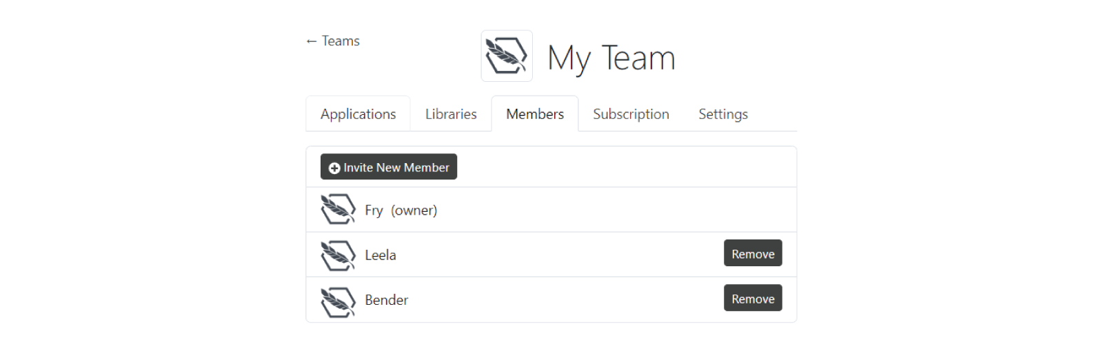
In Members you can find all the members of your team. The one who created the team for the first time becomes the owner of the team, allowing them to access Settings, where ownership can be transfered. Invite New Member via email allows more people to access your team and apps. As owner you can remove people from your team. As a member of a team, you can leave the team anytime.
Subscription

In Subscription you can find:
-
Subscription plan: Lite, Standard or Pro, which allow access to different extra features and plugins. You can read more in https://dynamaker.com/pricing/.
-
Deploy slots: where the apps can be alocated to. When an app is published to the web or released for the first time, a deploy slot is taken. Additional slots can be unlocked by purchasing an extra subscription, regardless of the plan.
In Upgrade subscription plan, you can upgrade your plan or purchase extra slots anytime.
Settings
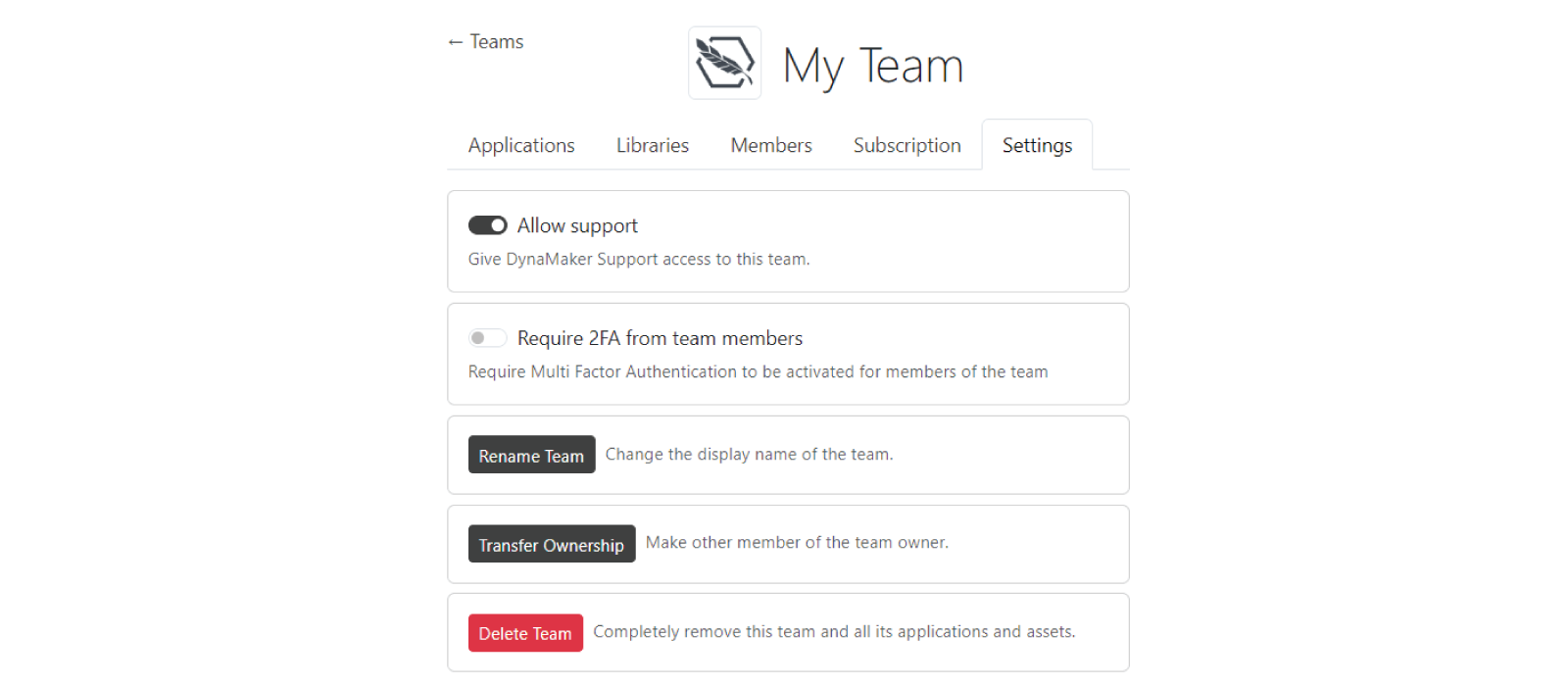
When you are owner of a team, Settings is available with some options to configure:
-
Allow support: grant access to DynaMaker Support at any time, allowing DynaMaker support professionals to provide faster and more accurate assistance whenever you require help.
-
Require 2FA from team members: enables the requirement of a two-factor-authentication (2FA) method for the team members, ensuring an extra layer of security for your team.
-
Rename team: to anything of your like, allowing special characters and spaces. Each team is tracked with their unique ID, so renaming it will not affect anything within DynaMaker.
-
Transfer ownership: to any other active member of the team, giving them access to these settings. Only one owner per team is allowed.
-
Delete team: with all its apps. Although it can be restored by contacting us (support@dynamaker.com), make sure to keep your dashboard clean and only with the necessary teams.
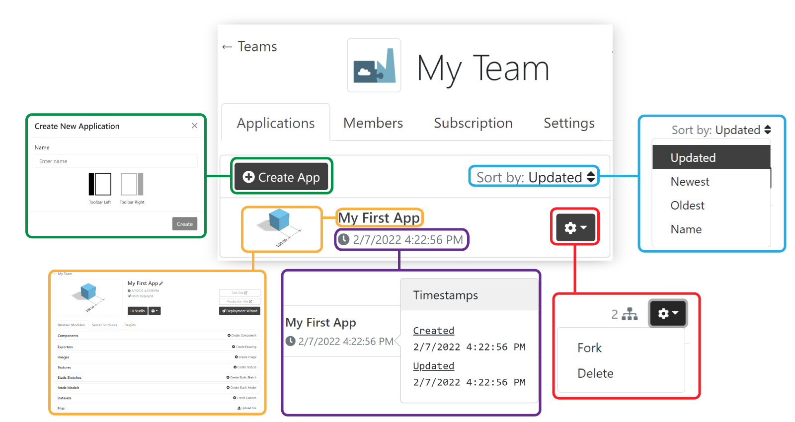
App Dashboard
When you go into one of your apps, you find the following:
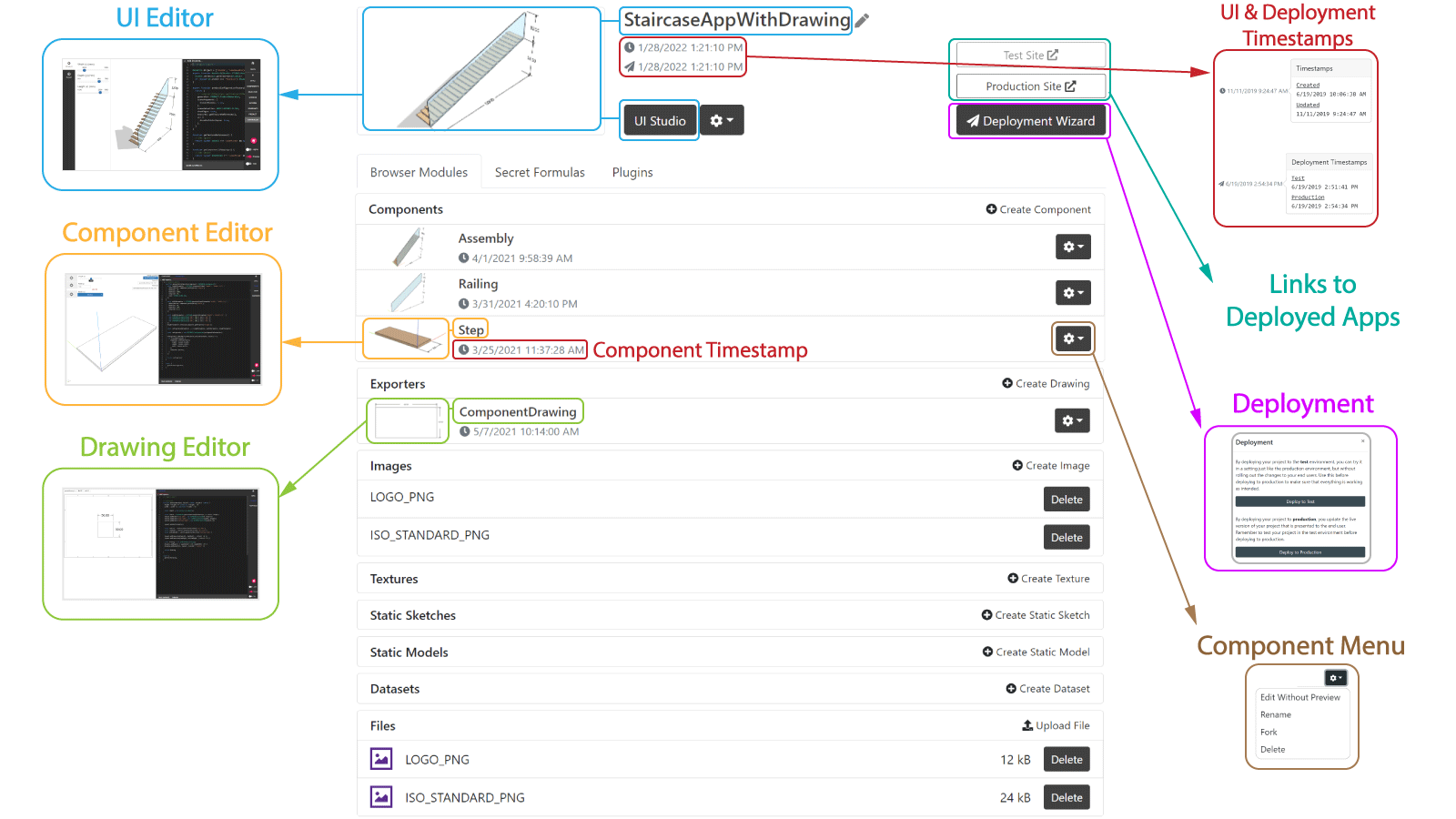
Here are the main features of your team dashboard, starting from top-left counter-clockwise:
- UI Editor to develop the user interface with which the end-user will customize its product.
- Component Editor to develop components involved in the app.
- Drawing Editor to develop drawing templates for exporting 2D drawings from the app.
- Upload files such as drawings, images, STL models or CSV tables that can be used in your app.
- Create images, textures, static assets and datasets from those files
- Each component and drawing has its own settings in ⚙️, including Edit without preview in case the editor hangs (e.g. due to an endless loop created by mistake).
- Deployment Wizard that deploys the app (built-in UI Editor) so it can be accessed by the end-users.
- Test Site and Production Site to go to your deployed apps.
- Deployment timestamps both for test & production sites.
- App timestamps for its creation and the latest update in any of the components, drawing, etc.
App Structure
So what do I need to care about when I start a new project? Just these 5 things:
UI
This is what your customers/users will interact with when they visit your application. Through the UI Editor you write all the logic needed for the app used by the end customer. It can include as many components as needed, for example:
- Actions that occur when you press a certain button.
- The behavior of selection with the mouse.
- The behavior assigned to keyboard shortcuts (hotkeys).
- All the buttons of the user interface that you can customize.
Components
Through the Component Editor you create all the components you use in your app. You can also create components and use them in other components, allowing you to add as many dependencies among components as complex your product is. You can create configurators for each component, including the rules, allowing you to have all the unique combinations your product needs.
Drawings
Optionally you can autogenerate drawings for your app. Including a preview section, you can import your components to see a temporary drawing (so you don't have to go back and forth to the application to test it), add your customized details and make it ready to use in your app.
Files
Optionally you can add extra files to complement the app. Pictures of your company logo for the drawing, tables with a lot of properties to create parameters with dynamic options, or predefined models and sketches that remain static in your application are some of the examples that you upload and use in your UI and components.
Deployment
When you've reached the point in your project when you want to share your application with someone else, you can deploy your application. You can think of a deployment as taking the current state of your application and saving it on a website that anyone can access. Of course, the deployed application could also require the end-user to authenticate before being able to access it.
In the Deployment Wizard, you find two buttons:
- Deploy to Test meant for validation and integration testing and sharing experimental changes.
- Deploy to Production meant to be used by the end customers. Once you deploy, anyone (with access) can use it.
Below is an example of a deployed app. Try it out, it is interactive!
Web Browser
Although DynaMaker can work in different web browsers, Google Chrome is preferable when both developing and using the applications to get the most out of the features, like the correct style of the user interface. Developing is only supported from a desktop environment while the deployed applications can be used from a mobile device such as a tablet.
Language: TypeScript
We use TypeScript as our language of choice for creating the dynamic tools. TypeScript is a typed version of JavaScript and is a well-established and documented language for building web applications.
Our tutorials require a very basic level of programming and we try to use simple and understandable functions for beginners. Even if you never programmed before or you forgot the programming lectures you attended years ago, don't worry, you will not have any problem. For those who are new to the language, we show some of the basics you need to know for starting with TypeScript:
-
variables:
- assign the variable (left) a value (right) with
=:
const material = 'steel'- use
letfor variables that are allowed to change through reassignment
let material = 'steel'
material = 'wood'- use
constfor variables that are not allowed to change through reassignment
const material = 'steel'- make lists with
[]:
const materials = ['steel', 'wood', 'plastic']- make objects by wrapping them in
{}, so that you can accessdensityby writingsteelMaterial.density:
const steelMaterial = {
  name: 'Steel',
  density: 7850,
  color: 0xcccccc,
} - assign the variable (left) a value (right) with
-
conditions:
- if-statements, compare variables with other values with
===. Optionally keep adding more exclusive if-statements withelse ifwith a condition and/or finish it withelseto cover the rest:
if (material === 'steel') {
  width = 100
} else if (material === 'wood') {
  width = 150
} else if (material === 'plastic') {
  width = 200
} else {
  width = 250
}- use in-line if-statement to save some space:
const width = material === 'steel' ? 100 : 250- use
switchas an alternative toif, make sure tobreak(stop) everycase. Usedefaultas the equivalent ofelse:
switch (material) {
  case 'steel':
    width = 100
    break
  case 'wood':
    width = 150
    break
  case 'plastic':
    width = 200
    break
  default:
    width = 250
    break
}- use boolean operators to bundle conditions:
if (material === 'steel' && width === 100) {
  /*do something */
} // if material is steel AND width is 100

if (material === 'steel' || width === 100) {
  /*do something */
} // if material is steel OR width is 100

if (material !== 'steel') {
  /*do something */
} // if material is NOT steel - if-statements, compare variables with other values with
-
functions:
- define them as
function, with their name, the arguments/inputs in()and what they do inside{}. They can do some logic and optionallyreturnsome output. You can add the type of variable to the input to assist you later.
function getMaterial(width: number) {
  if (width === 100) {
    return 'steel'
  } else {
    return 'wood'
  }
}
function removeAllComponents() {
  // whatever logic to remove components
}- use them accordingly (whether they
returnsomething or not):
const width = 100
const material = getMaterial(width)
removeAllComponents() // it doesn't return anything, so no need to assign it to anything- you will see in-line functions (
() => {}) that save space in the code. This is usually found in functions that trigger another function (typically triggering update geometries when you are done with a configurator).
- define them as
-
print anything in the Console of your browser DevTools (F12 in Google Chrome):
console.log('Hello there!') -
loops:
forloop driven by a variable:
const nrCoffes = 100
for (let i = 0; i < nrCoffes; i++) {
  console.log(`Fry drinks coffee number ${i}`)
}forEachloop driven by a list:
const coffeeTypes = ['black', 'white', 'capuccino']
coffeeTypes.forEach((coffeeType, coffeeId) => {
  console.log(`Fry drinks a ${coffeeType} coffee, number ${coffeeId}`)
})- avoid using other loops (e.g. do-while) that might cause infinite loops easily.
These are the basics and of course there is more! Here are some other examples you can learn from:
Don't forget to check any open documentation available in JS, including the try-it-yourself one. Otherwise, we'll be happy to help you find resources so the language is not a problem!
DynaMaker Code Editors
In DynaMaker there are 3 different editors:
Each one contains all the logic needed to generate the components, UI and drawings (if any). In these subsections it is explained how the tabs within those editors are related and how are connected. Although here they are not explained in detail, it helps to have an overview on how things are connected. However, you will understand better how these are connected while doing the tutorials. Typically this how the skeleton of most of the apps look like and can include:
- UI, that the user interacts with, uses a top-level component (e.g. Assembly) and possibly a Drawing.
- A top-level component (typically an Assembly) that could contain different subcomponents (e.g. Component A and Component B), which could contain subcomponents again (e.g. Component A1 and Component A2)
- A drawing that is used in the UI as a way to export your product as a PDF for e.g. manufacturing purposes.

Although this is the most common example, you can define the complexity of your app how you want. For example
- the UI can use more than one top-level component (or assembly) or even their subcomponents directly.
- there can be more than one drawing used in the UI and even use subcomponents in them.
- there can be a component for the purpose of sharing the same constants across the app.
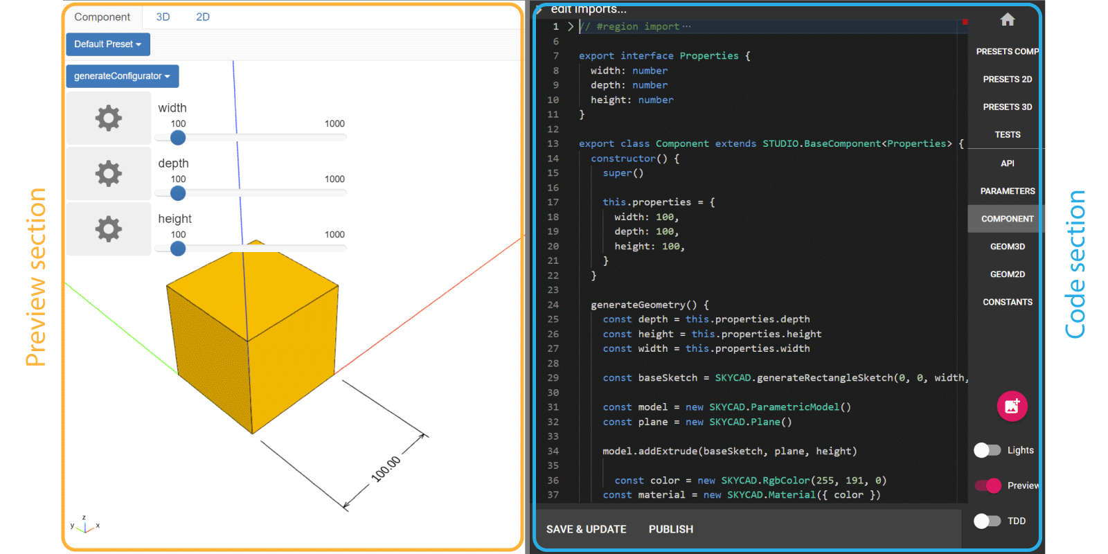
Component Editor
The Component Editor consists of multiple tabs that are meant to be connected in a ideal or recommended way. For a component named MyComponent, these tabs are:
- MYCOMPONENT to export everything from the current component that is needed in other components, UI or drawings.
- PARAMETERS to create all the configurators that need the component from COMPONENTS.
- COMPONENTS that creates the actual component, containing the logic about properties, geometry to show and more.
- GEOM3D meant for storing all functions that generate models that are going to be used in COMPONENTS.
- GEOM2D meant for storing all functions that generate sketches and layouts that are going to be used in GEOM3D (e.g. in extrusions).
Of course there are other situations where some other connections could exist:
- PARAMETERS might not be imported in MYCOMPONENT if there's no configurator to be used (e.g. a subcomponent).
- GEOM2D can be imported into COMPONENTS if a layout is used directly (e.g. in geometry as dimensions)
- CONSTANTS, that is not mentioned here, can be of course used in all tabs, even exported through MYCOMPONENT to be used in other places.
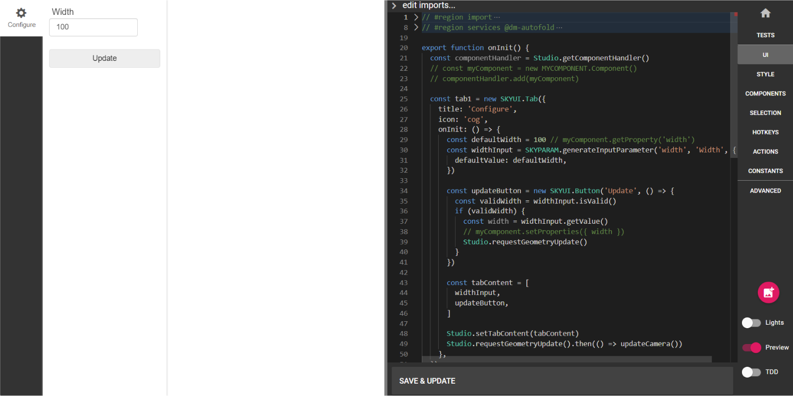
UI Editor
The UI Editor consists of multiple tabs that are meant to be connected in a ideal or recommended way. However in the default template, most of these tabs are empty and therefore not connected. These tabs are:
- ADVANCED meant for initialize the app by triggering the default function onInit() from UI.
- UI meant to build the user interface that the user is going to interact with.
- COMPONENTS to store all the logic of the components involved in UI.
- HOTKEYS to bind custom behaviors as keyboard shortcuts.
- SELECTION to store all the logic to handle user interaction with the canvas, models, etc.
- ACTIONS to store all that happens in the app and can be triggered by any button, hotkey, selection event, etc.
- STYLE meant to customize the appearance of the UI of the app by overwriting its CSS.

Similarly as in the Component Editor:
- all tests can be seen through the toggle TDD at the bottom-right corner.
- CONSTANTS that is not mentioned here can be of course used in all the editor tabs.
- TESTS that is not mentioned here can contain logic to test imported from ACTIONS, COMPONENTS or even SELECTION.
Drawing Editor
The Drawing Editor can be thought as a simplified version of a component that consists of a few tabs:
- API to export everything from the current drawing (usually just what is in DRAWING) that is needed typically used in the UI.
- PRESETS meant to store all the presets of the drawing from DRAWING.
- DRAWING that creates the actual drawing, containing the logic about its size, content and more.
- TESTS that is not mentioned in the diagram can contain logic to test behaviors from API

The Drawing Editor has support for presets, which can be found in the top-left corner too (orange in picture):

DynaMaker Libraries
In Typescript there are a few pre-built functions that are useful in some cases. For example, we can write the number π
through the Typescript library Math like the following with some other useful mathematical functions:
const piNumber = Math.PI
const piCosinus = Math.cos(piNumber)
However, these are very limited and therefore DynaMaker would lack a lot of functionalities. In DynaMaker you can make use of our custom libraries, which include a lot more of pre-built functions to avoid headaches with the maths and much more. There are 8 different libraries depending on what you want to do:
- SKYMATH: handles pure-math vectors and operations.
- SKYCAD: handles 2D, 3D geometry and CAD features.
- SKYPARAM: handles parameters and configurators.
- SKYUI: handles user interface elements through tabs and buttons.
- SKYDRAWING: handles exportable drawings like PDF or DXF.
- PRESET: handles test cases for visual representations.
- SKYEXPORT_POLY: handles exporting 3D geometry to polygon formats like STL and PLY.
- STUDIO: handles states and component handling in a project.
Even though they have a lot of information, we recommend you to look at these libraries once you have completed the tutorials. By then you will have a better understanding of the potential of DynaMaker as a tool, and you might want to look at the full potential later on by digging into the libraries and see what they have.
Since we are adding content constantly, it would be impossible to learn all this functions. In DynaMaker the Code completion will help you to complete what you are about to type or even explore what the libraries offer.
Keyboard Shortcuts
Do you want to program faster? Take a look at the most common keyboard shortcuts. Depending on in which section your cursor is, keyboard shortcuts and mouse buttons behave differently.
Preview section
It follows the classic and simplified CAD camera buttons. Considering the camera target the center position of the
preview (on the ground at (0,0,0) by default):
- Left-click: interacts with UI (if any).
- Right-click: rotates the camera around the target.
- Scroll up/down: zooms in/out.
- Wheel button: pans camera.
It is also possible to rebind these buttons with your own preference here. Check this section to see all the camera settings.
There are no default keyboard shortcuts. However, you can create your own with the behavior you want. We call them hotkeys and they are covered in one of the tutorials.
Remember also that F12 opens the browser console for debugging.
Code section
It follows the common keyboard shortcuts for a programming language editor. You can find these and more shortcuts by pressing F1 in the code section, and type in the word you are looking information about:

Copy & Paste
- Ctrl+C: to copy the selected area or the entire row if nothing is selected
- Ctrl+V: to paste what has been copied
- Ctrl+X: to cut (copy & remove) the selected area or the entire row if nothing is selected
- Shift+Alt+⬇️/⬆️: to copy the rows selected and paste them into the row below/above
Redo, Undo And Save & Autoformatting
- Ctrl+S: to save and update the changes (same as Save & Update)
- Ctrl+Z: to undo
- Ctrl+Shift+Z: to redo (same as Ctrl+Y)
- Shift+Alt+F: to autoformat
Find And Replace
- Ctrl+G: to go to the number of row typed
- Ctrl+F: to find a word
- Ctrl+H: to find and replace a word
- Alt+C: to enable matching case
- Alt+W: to enable matching whole word
Comments
- Ctrl+': to comment (out) the entire row
- Shift+Alt+A: to comment (out) the area selected
Group code
-
Ctrl+K and Ctrl+0: to fold all functions
-
Ctrl+K and Ctrl+J: to unfold all functions
-
// #region in one row and // #endregion in another row below to be able to collapse the code whatever is between them. Additional comments can be written next to them. As an example:
// #region Door
const doorComponent = new DOOR.Component()
doorComponent.setProperties({ height: 2000 })
this.componentHandler.add(doorComponent)
// #endregion