My First App
Let's create your first app to get started with DynaMaker!
In this tutorial, you will learn the basics of creating an app in DynaMaker and deploying it so anyone can use it! Although we recommend reading the good-to-know section for having an overview of how DynaMaker is structured and other programming tips, here you will see how easy is to deploy an app even without knowing the background.
For this we will follow 4 simple steps:
Don't forget to check the common mistakes if you get stuck. Good luck!
1. Create App
In your team of your team dashboard, create your own app and name it e.g. MyFirstApp (spaces are allowed too).

When you go into your new app, you will see the app dashboard, containing everything related to the app, UI, component containers, drawings, deployment, files, and more.
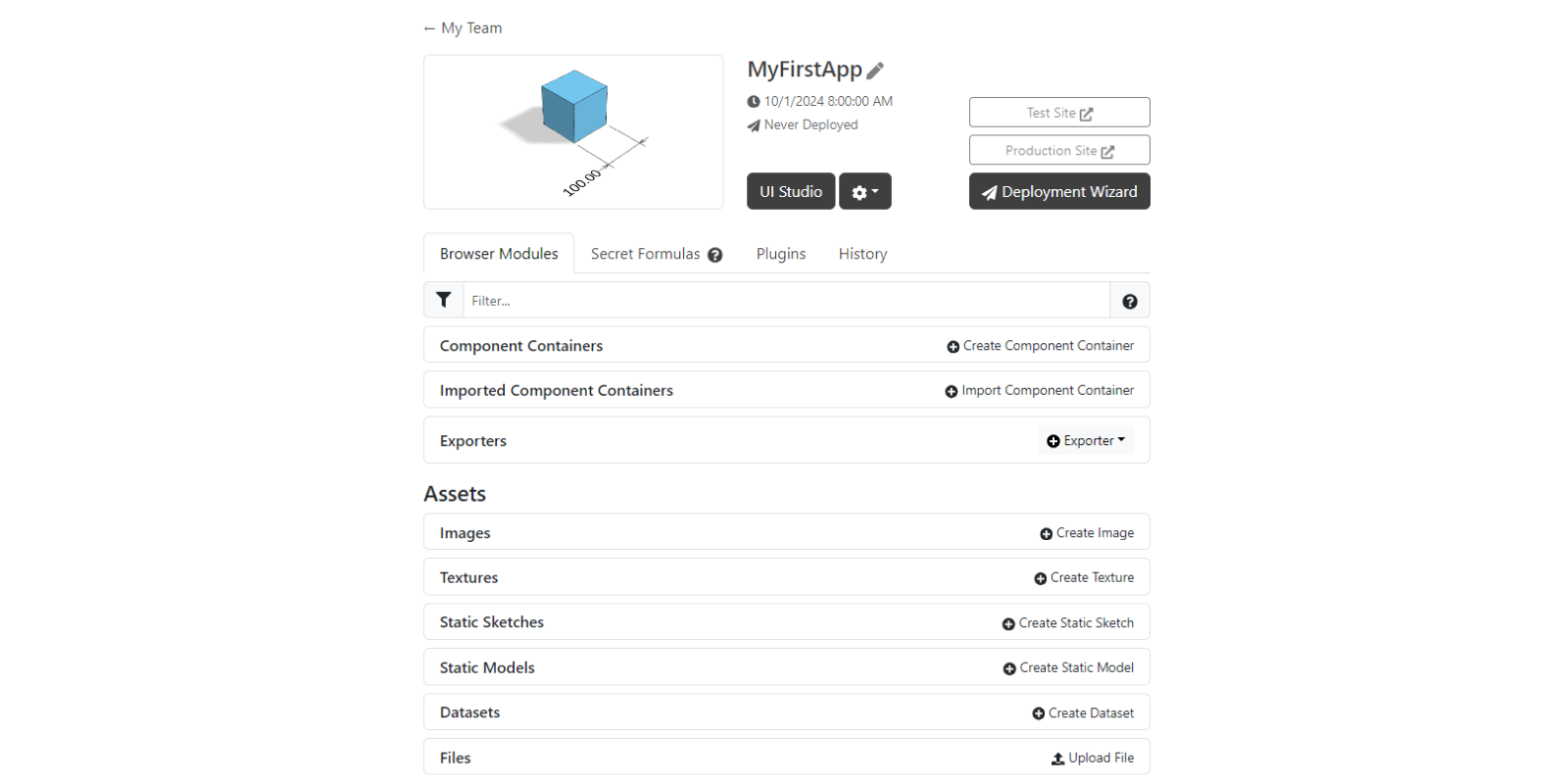
For now we will start by creating a component container and modifying its default geometry. Then we will connect this component to the UI, modify it and finally deploy the app.
2. Create Component Container
To start with the component container:
- Create a new one and name it e.g. Cubes:
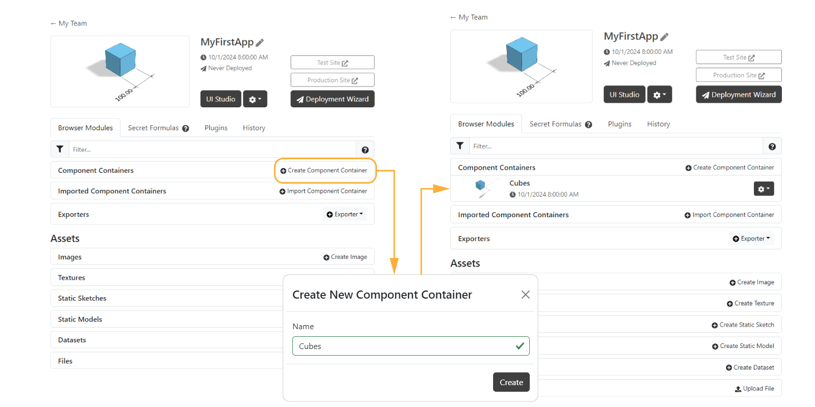
- Go into the component container by clicking on its thumbnail or name.
- You will see the Component Editor in two sections: the code (right) that generates the preview (left):
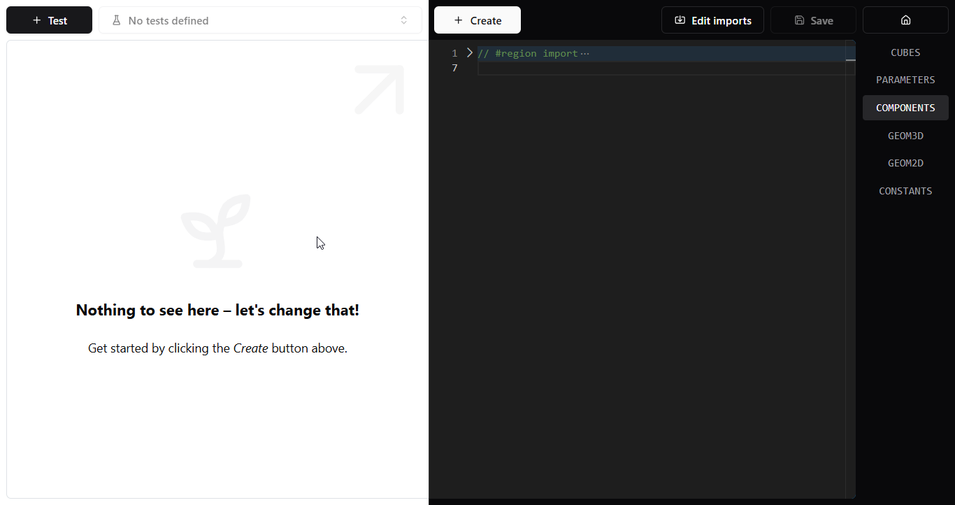
To start with, the code and preview are both empty. Let's fix that!
- Click the + Create button and select Component.
- In the form you can adjust the name (i.e. Cuboid), kind and properties of the component, but let's use the defaults. You can change these later in the code.
- Click on Create Component to continue.
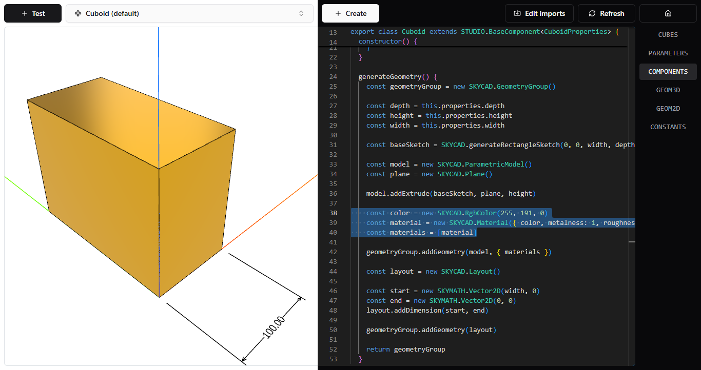
To start with the geometry, let's change the color of the component container. For this:
-
See that in COMPONENTS there is a function called
generateGeometry() -
In here you can see that we define some
materials, which containscolor. You could simply replace it with the color you like in the RGB standard. Try dark yellow as RGB(255, 191, 0)with a metallic feeling withmetalness: 1androughness: 0in the material:generateGeometry() {
// properties and model here
const color = new SKYCAD.RgbColor(255, 191, 0)
const material = new SKYCAD.Material({ color, metalness: 1, roughness: 0 })
const materials = [
material,
]
const geometryGroup = new SKYCAD.GeometryGroup()
geometryGroup.addGeometry(model, { materials })
// dimension in layout here
return geometryGroup
}
Save and apply your changes with Save, so you see the golden geometry.
3. UI
In order to return to the app dashboard, you can simply click on the top-right icon with the house. To start with the UI, let's change the title of the UI tab and then connect the component container.
A. Modify UI
Let's start by changing the title of the tab:
- Back in your app dashboard, go into the application by clicking on UI Studio, thumbnail or title of the app.
- Again you will see the UI Editor: the code (right) creates the preview (left), which is in the end how the app would exactly look to the end user:

- In UI, see the function
onInit()with tabtab1. - Change the
titleof the tab, from the currentConfigureto e.g.Cube. - Save & Update to apply this change, so you see the UI updated:
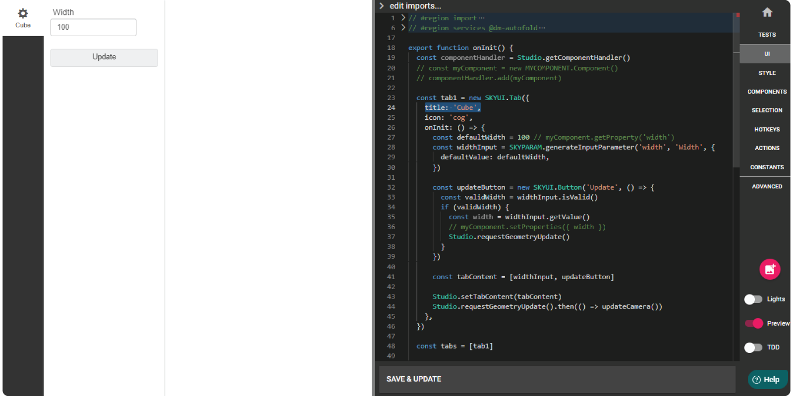
Great! Let's connect the component container with the UI.
B. Import Component Container
First off, we need to import the component container into the UI, so it's available to use in the UI Editor.
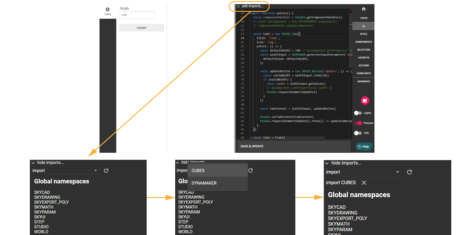
In order to import a component container in the UI:
- Click on
edit imports...at the top of the code editor - If you published the component container correctly, you will see CUBES in the list of available imports. If you don't see it refresh the available imports with the spinning arrow icon next to it.
- Finally, import the component container by clicking on its name.
C. Connect Component Container
Once the component container is imported, we can connect the current default Width parameter. Notice that in onInit() of
UI, there are some lines commented. These are the ones that we will enable again so that we use the component container
Cubes. For this:
-
Add the component container Cubes to the UI, through the
componentHandler, so like:export function onInit() {
const componentHandler = Studio.getComponentHandler()
const cubeComponent = new CUBES.Cuboid() // Cuboid = name of your component within CUBES.
componentHandler.add(cubeComponent)
// rest (tab1 and more)
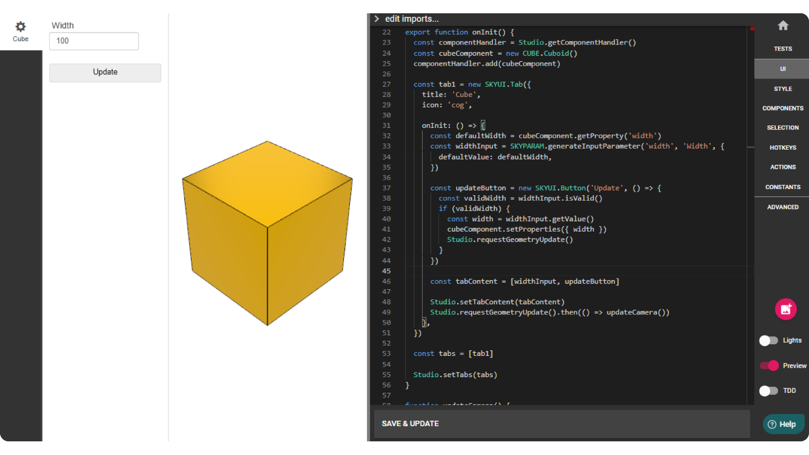
} -
If you Save & Update you will see the golden cube on the preview (left):
Great. As a final step, let's connect the default Width parameter with the component. For this make sure:
- the default value of the parameter
defaultWidthcomes from the property ofcubeComponent. - the value of the parameter
widthInputis passed to the propertywidthofcubeComponentwithcubeComponent.setProperties() - with these changes,
tab1should look like:
export function onInit() {
  // component

  const tab1 = new SKYUI.Tab({
    title: 'Cube',
    icon: 'cog',
    onInit: () => {
      const defaultWidth = cubeComponent.getProperty('width')
      const widthInput = SKYPARAM.generateInputParameter('width', 'Width', {
        defaultValue: defaultWidth,
      })

      const updateButton = new SKYUI.Button('Update', () => {
        const validWidth = widthInput.isValid()
        if (validWidth) {
          const width = widthInput.getValue()
          cubeComponent.setProperties({ width })
          Studio.requestGeometryUpdate()
        }
      })

      const tabContent = [widthInput, updateButton]

      Studio.setTabContent(tabContent)
      Studio.requestGeometryUpdate()
    },
  })

  const tabs = [tab1]
  Studio.setTabs(tabs)
}
- Save & Update to apply changes and be able to update the width of the cube.
In this case as you see, there's no need to publish, because the project always uses the latest version of the application. When we are done with the changes and make sure everything works as intended, it's time to deploy this application, so you can share it with anyone in a link!
4. Deployment
As the final step of a project, we deploy an application when it is ready to be used by the end user. For this:
- Back in your app dashboard, click on Deployment Wizard at the top-right.
- You can skip the tests for now to jump directly to final step of deployment.
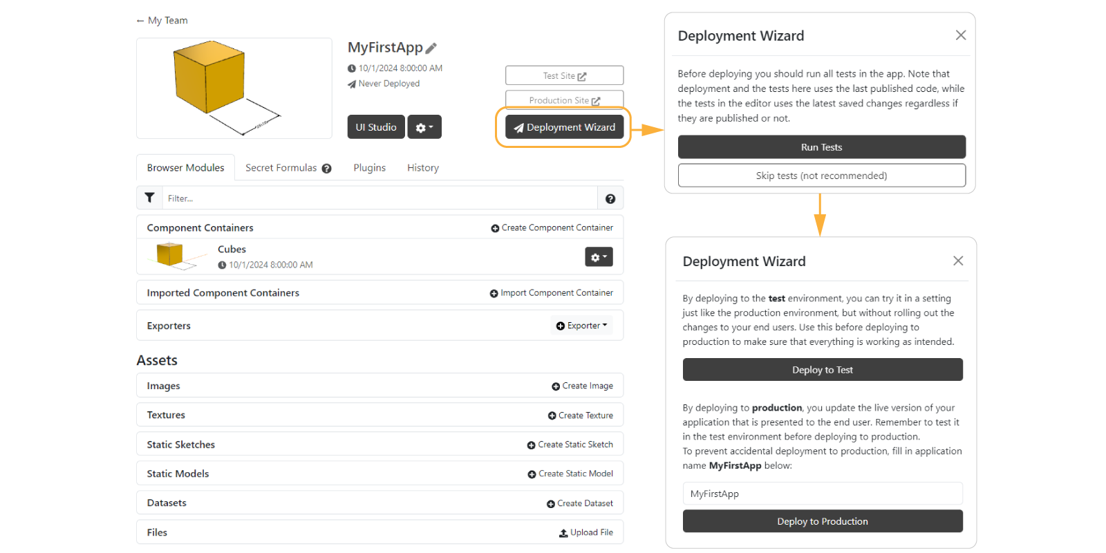
For those who don't have a subscription plan in DynaMaker, you will see that you won't have any available slots. For that you need to upgrade your plan first. Until then, you can keep developing your apps (or doing the tutorials) and upgrade your license when you are ready to deploy your apps.
For those who do have a subscription, projects will be deployed as private, protecting the source code. You can read more about the 2 available deployment environments here.
Congratulations! You have finished the first tutorial. This is how the app would look like in a iframe with this link: https://deployed.dynamaker.com/applications/iqKro4BqBgJ/
Do you want to have a copy of this app in your team? Let us know at support@dynamaker.com! Remember that everyone has their own way of developing and there are multiple valid ways to do things as long as anyone can understand the code!
Now that we know the very basics of an app and deployment, let's go deeper in the component container in the next tutorial My First Component.