STUDIO
This library has a collection of UI features, camera handling, component handler and more:
- Actions
- UI items
- Modals
- Camera handling
- Editor settings
- Taking pictures
- Selection handling
- Notifications
- Components
- Libraries
- Configuration info
- Scene settings
Actions
As best practices in DynaMaker, when we are working in the app, we use actions to wrap specific logic into functions, under ACTIONS, so that they can be used easily in UI. Actions refer to something that happens, so it is very common and convenient to use actions when we click on certain buttons and tabs, or when we are done with a configurator in its callback.
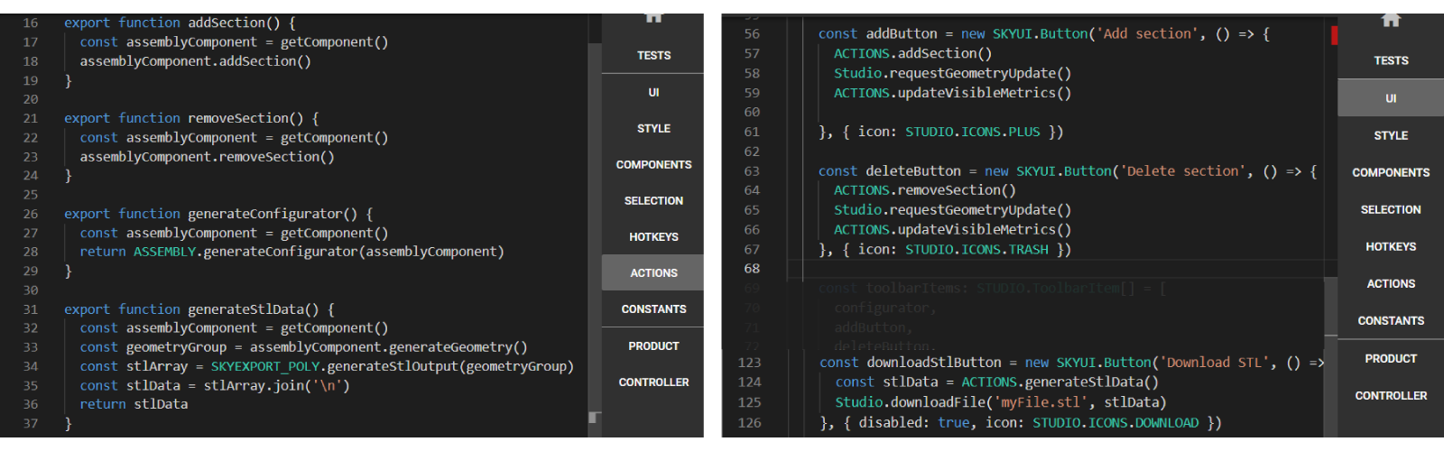
Taking the example of the tutorial with the conveyors in the following picture, there are 4 actions:
ACTIONS.addSection(): to add a new section to the assembly according to the parameters.ACTIONS.removeSection(): to remove the last added section to the assembly.ACTIONS.generateConfigurator(): to generate the configurator from the assembly component.ACTIONS.generateStlData(): to generate the data to download the proper file.
Remember to write
exportbeforefunction, so that they can be called in other code-editor tabs, like UI, HOTKEYS, etc.
As any function in TypeScript, actions in DynaMaker can do some logic (like ACTIONS.addSection()), generate
something (like ACTIONS.generateConfigurator()), get a component that could be used as input in drawings or update the
camera with a default travel time and direction when switching tab or clicking a
quickbar item:
export function getAssemblyComponent() {
  const component = manager.getComponentHandler().getComponents(ASSEMBLY.Component)[0]!
  if (!component) throw new Error('Could not find assembly component')
  return component
}

export function updateCamera({ travelTime = 750, direction = new SKYMATH.Vector3D(1, 1.5, -0.75) } = {}) {
  manager.setCameraToFitBounds({ direction, travelTime })
}
UI Items
There are other ways to customize the UI apart from adding SKYUI.Button and
SKYUI.Tab. In your DynaMaker application it is possible to add:
These can be added in the predefined function
onInit()in your application (UI).
Menu Items
You can add a Menu dropdown to the top-right corner, where you add SKYUI.Button which any
functionality (e.g. change unit system, language, rename configuration, save as new configuration, etc).
The following example contains a Menu with Save and Load buttons. Custom pop-ups have been made for the picture below, but you can find more info about save & load briefly here.

Studio.setMainMenuItems([
  new SKYUI.Button('Save', () => {
    /*logic to save*/
  }),
  new SKYUI.Button('Load', () => {
    /*logic to load*/
  }),
  new SKYUI.Button('Language', () => {
    /*logic to change language*/
  }),
  new SKYUI.Button('Unit system', () => {
    /*logic to change unit system*/
  }),
])
Quickbar Items
You can add buttons to the Quickbar at the top.
The following example contains a button Home to recenter the camera to an ISO view, and Delete with a custom function to delete any possible selected component. Notice that there are some optional arguments to use:
actionto trigger any functionality needed.iconto change its appearance with a predefined (icon)[library-studio#icons].imageto change its appearance with an image (created from assets).tooltip(as string) to show when hovering the mouse over it.disabledto disable it with a greyed-out appearance.

Studio.setQuickBarItems([
  {
    name: 'Home',
    icon: 'home',
    action: () => {
      Studio.setCameraToFitBounds()
    },
    tooltip: 'Reset Camera',
  },
  {
    name: 'Delete',
    image: ASSETS.IMAGES.TRASH,
    action: () => {
      ACTIONS.deleteSelectedComponent()
    },
    disabled: true,
    tooltip: 'Delete',
  },
])
How to update Quickbar Items dynamically
If you want to update dynamically the Quickbar items (e.g. if something is selected then the delete item with the trash
image should be enabled, otherwise disabled), then simply reset the quickbar items by using Studio.setQuickbarItems().
For that then it's recommended to wrap the quickbar items in a function so that you can call it within an action of a
SKYCAD.Button or within a callback of a configurator, as
Studio.setQuickbarItems(getQuickbarItems(disableDelete: true)).
function getQuickbarItems({ disableDelete = false } = {}) {
  return [
    {
      name: 'Home',
      icon: 'home',
      action: () => {
        Studio.setCameraToFitBounds()
      },
      tooltip: 'Reset Camera',
    },
    {
      name: 'Delete',
      image: ASSETS.IMAGES.TRASH,
      action: () => {
        ACTIONS.deleteSelectedComponent()
      },
      disabled: disableDelete,
      tooltip: 'Delete',
    },
  ] as STUDIO.QuickBarItem[]
}
In the app below, notice how the quickbar item Download 3D (STEP) becomes disabled when height < 3000.
Metrics
Sometimes in your application you want to let the user know about certain values while designing. Usually when you are configuring your product, you want to update those values dynamically.
The following example contains information about the material, color & volume of the cube.

Studio.defineVisibleMetrics([
  {
    id: 'material',
    value: `PVC`,
    label: 'Material: ',
  },
  {
    id: 'color',
    value: `Blue`,
    label: 'Color: ',
  },
  {
    id: 'volume',
    value: `1000 cm³`,
    label: 'Volume: ',
  },
])
How To Update Them Dynamically
In order to update the metrics dynamically, we need to update the metrics when we update the parameters.
For example, the cube volume needs to be updated when changing the size given by the parameters. Since the only
configurator that exists in the template is in the Product tab, we can add an addUpdateCallback() so that it updates
the metric with id 'volume' through Studio.updateVisibleMetric(). Then, you should have the following:
function generateProductTab(Studio: STUDIO.StudioService): SKYUI.Tab {
  const tabTitle: string = 'Product'

  const toolbarGenerator: STUDIO.ToolbarGenerator = () => {
    const configurator = ACTIONS.configureMainComponent()

    configurator.addUpdateCallback((valid, value) => {
      if (valid) {
        const cubeVolume = ACTIONS.getCubeVolume()
        Studio.updateVisibleMetric('volume', `${(cubeVolume / 1000).toFixed(1)} cm³`)
      }
    })

    const toolbarItems: STUDIO.ToolbarItem[] = [
      configurator,
    ]
    return toolbarItems
  }

  const tabArgs: STUDIO.TabArgs = {
    ... // whatever you have
  }

  return new SKYUI.Tab(tabTitle, toolbarGenerator, tabArgs)
}
Notice that here we have created previously a function getCubeVolume() in ACTIONS that gives the
multiplication of width, depth and height of the component in mm³. Then we divide by 1000 to make it cm³ and leave
1 decimal with .toFixed(1).
As another example, in the app below, notice how the metric item Download 3D (STEP) becomes hidden when
height < 3000.
If you wonder how to update the metrics instantly, read more here.
Show/hide metrics
Studio.updateVisibleMetric('volume', { hidden: true })
Studio.updateVisibleMetric('volume', { hidden: false })
HTML Elements
In DynaMaker it's possible to add HTML elements directly to the tab. As an example of adding some text into the app's template:
const tab1 = new SKYUI.Tab({
  title: 'Configure',
  icon: 'cog',
  onInit: () => {
    // widthInput & updateButton

    const divElement = document.createElement('div')
    divElement.innerText = `Update to change cube's width`

    const tabContent = [widthInput, updateButton, divElement]
    Studio.setTabContent(tabContent)

    // other functions (e.g. camera and geometry updates)
  },
})

You can find more info about HTML elements here.
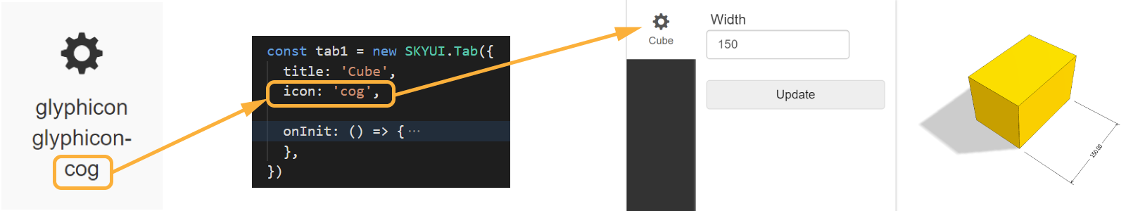
Icons
Icons can be added to other UI elements, mainly used in tabs and buttons. In order to use them, take the name of the
icon and add it as a string in the optional argument icon of your tab or button, like:
The default set of icons available in DynaMaker can be found here.
Use the IntelliSense to assist you with the code completion, press Ctrl+Space within the string to see them like:
Alternatively, pictures from ASSETS can be used as well instead, like:
icon: ASSETS.IMAGES.MY_COG. Additional adjustments might need to be done with a custom CSS snippet in STYLE.
Modals
Use modals to get the attention of the user in certain moments. Giving short tips when entering a complex selection mode, forcing to select certain parameters that heavily affect the model or filling a form to complete a quotation with the user's email with an attached custom drawing, are some examples of use. There are many predefined modals built in DynaMaker that are already to use:
Info Modal
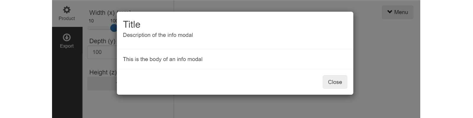
Use an info modal to give any information to the user as a pure description or warning. For example when clicking a button that allows a special selection mode or a warning about constraints from the parameters selected.
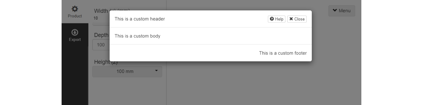
Studio.openInfoModal('Title', 'Description of the info modal', 'This is the body of an info modal')
It is possible to have a custom header and footer in HTML, so anything can be included in those, like text, pictures,
videos, links, iframes, etc (see HTML examples here). Simply use the
optional arguments headerHtml and footerHtml.
Studio.openInfoModal('Title', 'Description of the info modal', 'This is the body of an info modal', {
  headerHtml: `<p>This is a custom header</p>`,
  footerHtml: `<p>This is a custom footer</p>`,
})
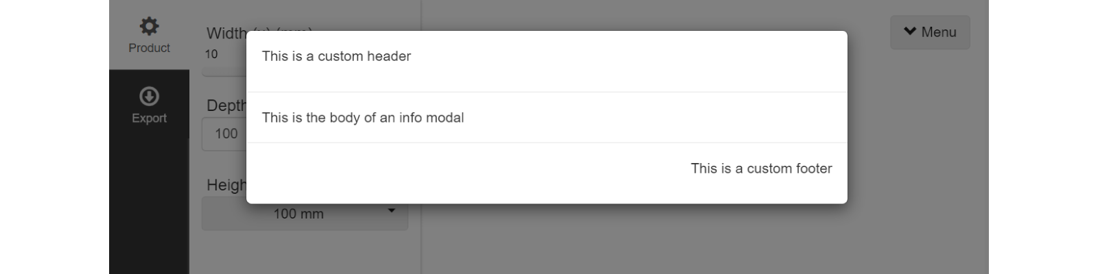
Keep in mind that the custom header replaces the title and description, and the custom footer replaces the default close button.
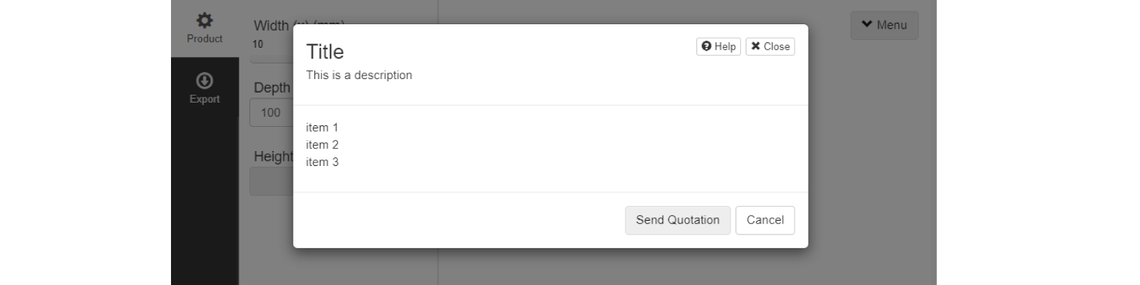
Items Modal
As a variation of the info modal, the items modal allows you to show information in multiple rows by default. It is also
possible to add extra functionality at the top-right of the pop-up by using the optional argument headerActions. Also,
it allows you to show/hide and rename the OK & Cancel button at the bottom right.
Studio.openItemsModal('Title', 'This is a description', ['item 1', 'item 2', 'item 3'], {
  okButtonText: 'Send Quotation',
  hideOkButton: false,

  cancelButtonText: 'Cancel',
  hideCancelButton: false,

  headerActions: [
    {
      label: 'Help',
      action: () => {
        window.open('https://docs.dynamaker.com')
      },
      icon: 'question-sign',
    },
    {
      label: 'Close',
      action: (modalControl) => {
        modalControl.close()
      },
      icon: 'remove',
    },
  ],
})
You could also use the optional arguments
bodyHtml,headerHtmlandfooterHtmlto have any custom HTML, but keep in mind that these replace the item list, title & description, and ok & cancel buttons respectively.headerActionsare still available.
Parameter Modal
With the parameter modal you can show all parameters of a configurator in a pop-up. A difference from showing
configurators in a tab as usual is that the thumbnail or icon is visible to easily identify what the parameter is
related to for example. Also, you can disable the default visual transition when open with the optional boolean argument
animation. See that headerActions, footerHtml and headerHtml can be used as well.
const configurator = ACTIONS.configureMainComponent()

Studio.openParameterModal(configurator, 'Configure cube', 'Choose width, depth and height', {
    animation: true,
    headerActions: [ ... ], // same as item modals
    // footerHtml: 'This is a custom footer',
    // headerHtml: 'This is a custom header',
  })
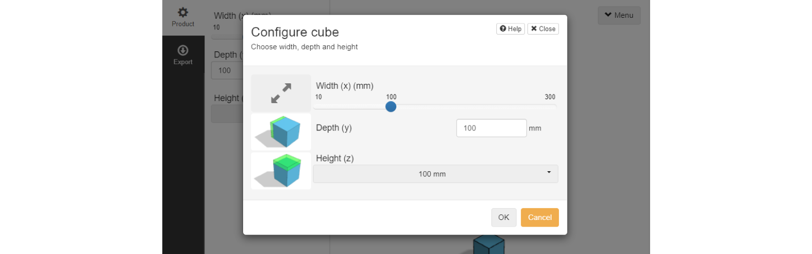
You can use predefined icons or custom pictures from ASSETS as thumbnails to the parameters in a modal using the optional arguments
iconandthumbnailrespectively as:
const widthParameter = SKYPARAM.generateSlider('width', 'Width (x)', {
  icon: 'resize-full',
})
const depthParameter = SKYPARAM.generateInputParameter('depth', 'Depth (y)', {
  thumbnail: ASSETS.URLS.THUMBNAIL_DEPTH_PNG,
})
const heightParameter = SKYPARAM.generateDropdown('height', 'Height (z)', options, {
  thumbnail: ASSETS.URLS.THUMBNAIL_HEIGHT_PNG,
})
Notice that the URL of the picture file has to be used for the
thumbnail. The URL of an asset is generated automatically when the file is uploaded to the app dashboard.
Keep in mind that this configurator still follows the rules and callbacks of the configurator from
ACTIONS.configureMainComponent().
However, we usually want to update the geometry right after we are done with the configurator to see the changes, or
perhaps we want to go into a second configurator that depends on this one. Since openParameterModal() is a promise,
these examples require .then() so the functionality mentioned can be easily implemented.
Update Geometry After Configurator
const configurator = ACTIONS.configureMainComponent()

Studio.openParameterModal(configurator, 'Configure cube', 'Choose width, depth and height').then((result) => {
  if (result !== undefined) {
    Studio.requestGeometryUpdate()
    Studio.requestLightweightGeometryUpdate()
    // other functions
  }
})
Notice that
resultisundefinedwhen clicking Cancel. On the other hand, when the configurator is valid, i.e. all parameters are valid, clicking OK gives an object asresultas in the following case, giving all the information of the configurator and its parameters:
result: {
  success: boolean,
  configurator: SKYPARAM.Configurator(),
  parameters: [
    SKYPARAM.SliderParameter,
    SKYPARAM.InputParameter,
    SKYPARAM.DropdownParameter,
  ]
}
In the example used before, you can see that when result !== undefined, we will update the geometry. However, more
functions can be added there of course.
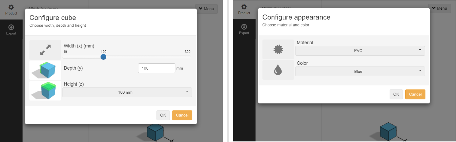
Nested Configurators
Another common example is when we have two nested configurators, called e.g. configuratorA and configuratorB, with
the following conditions:
configuratorAshould be the first configurator to be open.- clicking OK in
configuratorAshould openconfiguratorB. - geometry and properties should be updated only if OK is clicked in both configurators.
- clicking Cancel in
configuratorBshould not apply changes fromconfiguratorA. configuratorBdepends on the parameters fromconfiguratorA.
let savedResultA
const configuratorA = ACTIONS.getConfiguratorA()
Studio.openParameterModal(configuratorA, 'Configure cube', 'Choose width, depth and height').then((resultA) => {
  if (resultA !== undefined) {
    savedResultA = resultA

    const configuratorB = ACTIONS.getConfiguratorB(savedResultA.parameters)
    Studio.openParameterModal(configuratorB, 'Configure appearance', 'Choose material and color').then((resultB) => {
      if (resultB !== undefined) {
        ACTIONS.setComponentProperties(savedResultA, resultB)
        Studio.requestGeometryUpdate()
        Studio.requestLightweightGeometryUpdate()
      }
    })
  }
})
Notice that
resultAneeds to be saved assavedResultAto be able to use it inACTIONS.setComponentProperties().
Form Modal
A form modal is a dialog box that contains a form for users to input data. The following steps explain how to create and
open a form modal using Studio.createFormModal():
1. Define the form fields
Define the form fields using an array of objects that represent each field. Each object must have the following properties:
type: the type of input field (e.g., text, number, date).id: the ID of the input field.
You may also specify additional properties for each input field, such as a label text or a required boolean flag.
2. Create the form modal
Create the form modal using the Studio.createFormModal() method. This method takes two arguments:
- An array of form field objects (created in step 1).
- An options object that specifies the configuration for the form modal, such as animation, modalClassName, and texts (for the title and feedback texts).
Assign the result of the Studio.createFormModal() method to a variable to reference the form modal object.
3. Open the form modal
To initiate the form modal, use the .open() method on the form modal object. This method will return a promise that
resolves with the form data once the user submits the form.
Here's an example of a form modal used to request a quotation when clicking on a button. Upon completion of the form,
the Studio.openInfoModal() function is used to confirm the request:
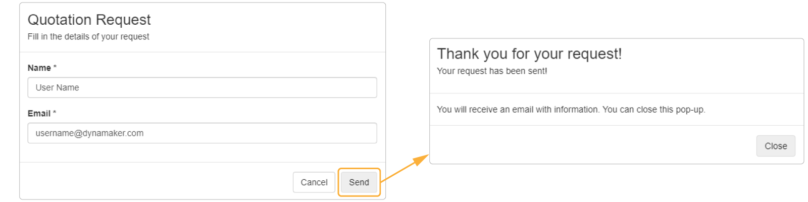
const quotationButton = new SKYUI.Button(`Request Quotation`, () => {
  const formModal = Studio.createFormModal(
    [
      {
        type: 'text',
        id: 'customerName',
        label: 'Name',
        required: true,
      },
      {
        type: 'email',
        id: 'customerEmail',
        label: 'Email',
        required: true,
      },
    ],
    {
      animation: true,
      modalClassName: 'quotation-modal',
      texts: {
        title: 'Quotation Request',
        description: 'Fill in the details of your request',
        cancelButton: 'Cancel',
        okButton: 'Send',
      },
    },
  )

  formModal.open().then((formData) => {
    if (formData) {
      Studio.openInfoModal(
        'Thank you for your request!',
        'Your request has been sent!',
        'You will receive an email with information. You can close this pop-up.',
      )
    } else {
      // Form modal was canceled
    }
  })
})
After the user is done with a modal, an email could be automatically sent to them or any other person at the same time. Read more about how to get the best use of the form modal with the DynaMaker plugin SendGrid.
Custom Modal
Would you like to request a completely customized modal that does not fit any of the options provided above? If so, please send an email to support@dynamaker.com outlining the specific features you require, and we will assist you in getting started.
Camera Handling
All Studio-related functions to the camera are best explained in the how-to example with an app.
Editor Settings
In any of the DynaMaker code editors, there are a few toggles and buttons at the bottom-right corner:
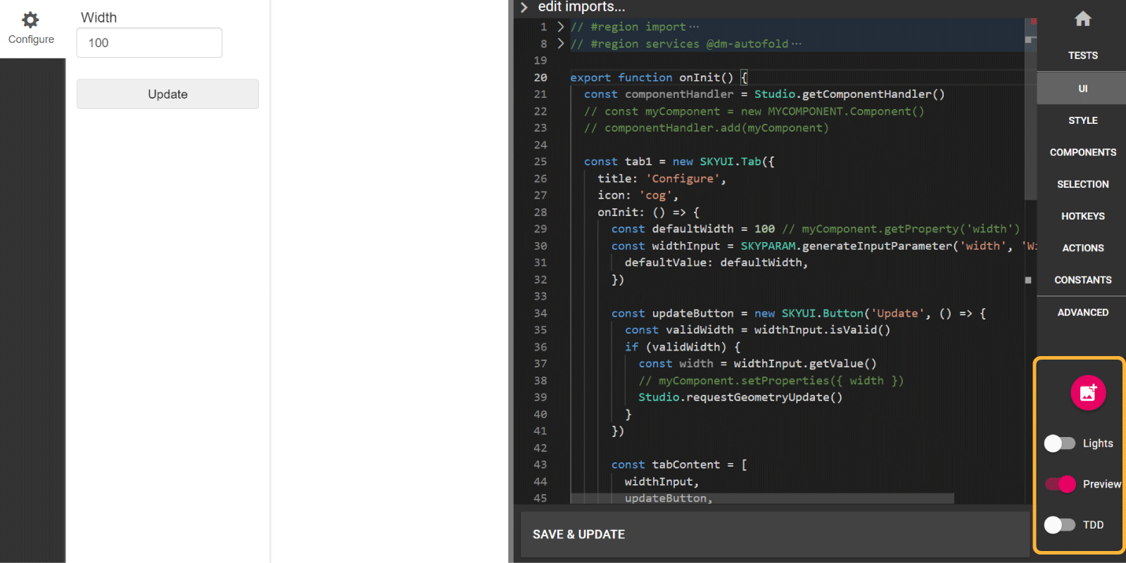
These are (starting from above):
- Set Thumbnail to update the thumbnail of the UI, components and drawings in the app dashboard.
- Lights to switch between dark and light mode.
- Preview to show/hide the preview.
- TDD (Test Driven Development) to show and run the tests (if any) of the current editor.
Taking Pictures
Do you want to take a picture of your project? There is an easy-to-use function in the Studio for that! Here is an
example of downloading a picture in the callback of a button.
const downloadImageButton = new SKYUI.Button(
  'Take picture',
  () => {
    Studio.requestImage({
      type: 'png',
      size: new SKYMATH.Vector2D(1600, 900),
      orthographic: true,
      background: {
        color: new SKYCAD.RgbColor(200, 200, 200, { alpha: 0 }),
      },
      disableCastShadows: true,
      camera: {
        behavior: 'fit-to-bounds',
        boundsOffset: 50,
        direction: new SKYMATH.Vector3D(1, 1, -0.25), // 'front' | 'rear' | 'iso' | 'top' | 'bottom' | 'left' | 'right'
        // bounds: new SKYCAD.Bounds3D(),
        // ignoreGeometryGroups: ['2D'],
      },
    }).then((image) => {
      return Studio.downloadFile(`My project.png`, image)
    })
  },
  { icon: 'download' },
)
where:
type: gives the format of the picture as.pngor.jpeg.size: gives the size of the picture (increasing quality and therefore file size!) and ratio.orthographic: changes between perspective or orthographic view.background: allows changing the color of the background of the picture, and by settingalpha: 0from aSKYCAD.RgbColorthen the background becomes transparent as a typical png picture.disableCastShadows: removes any possible shadow casted to the ground or other elements.camerawith either:behavioras'fit-to-bounds'with:boundsOffsetincreasing the visible bounds with a number in all directions (useful when we want some margin in the picture)direction: as either aSKYMATH.Vector3Dor predefined direction such asiso,frontandleft.boundsto override the default bounds (what you see in the visualization).ignoreGeometryGroupsto ignore a list of string IDs that won't be taken into account for autofit.
behavioras'fit-to-bounds'with:cameraPositionasSKYMATH.Vector3Dof the point where the picture is taken from.cameraTargetasSKYMATH.Vector3Dof the point where the picture is taken towards.
Selection Handling
There are up to 5 different types of events you can reach through clicking or moving the mouse. Below we describe how to get them, and must not be mixed with the camera controls:
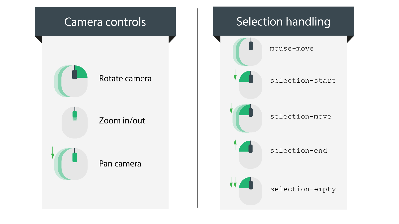
Read more here to rebind the camera default buttons.
They can be found only in the Application, which the user will interact with, under SELECTION, in the
function selectionEvent(). The specific type can be found in the first argument like event.type and it is common to
follow this pattern using a switch statement:
export function selectionEvent(event, selectionPosition: SKYMATH.Vector3D, manager: STUDIO.Manager) {
  switch (event.type) {
    case 'mouse-move': // moving the mouse without clicking
      break
    case 'selection-start': // left-clicking the mouse (down click)
      break
    case 'selection-move': // left-clicking & moving mouse at the same time (down & drag click)
      break
    case 'selection-end': // releasing the left-button the mouse (up click)
      break
    case 'selection-empty': // double left-clicking the mouse quickly
      break
  }
}
selection-emptyempty can be reached also by:
- pressing key Esc.
- single left-clicking outside the world.
In order to the see/change the world:
- Go to CONTROLLER.
- In the function
productConfigurationFactory(), check two things:
sceneSelectionto toggle the visibility of the ground, which can be:
WORLD.SCENES.STANDARD: to make the ground visible.WORLD.SCENES.CLEAN: to make the ground invisible.worldSize: make sure it is bigger than your product, soworldSize: { x: 20000, y: 20000, z: 300 }could be a good size for now to avoid strange selection behavior.Notice that the component always starts in the origin of the world size (0, 0, 0). But don't worry, we will make this more simple in the future, so you don't have to care about the world and its size anymore.
Notifications
When interacting with the canvas, sometimes the visual feedback given by layouts or block zones is not enough and we want to know whether an action took place successfully or not. We can use a notification to help the user to know what happened at a specific point. There are four different types to use and here we show how to implement them in the application.
How To Use
Wherever the Studio or manager exists:
Studio.displayNotification('Action completed', { type: 'success' })
manager.displayNotification('Invalid position', { type: 'danger' })
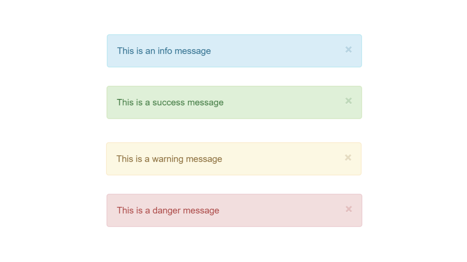
Examples
As inspiration, these are the most common examples to use the notifications on:
- Info:
- to briefly describe the functionality of a tab/button that has been clicked
- Success:
- files have been downloaded
- order has been put in the production queue
- an algorithm, that automatically adds multiple components, has finished
- Warning:
- a component has been added but due to some constraints, it doesn't have a specific subcomponent
- when changing a parameter that removes subcomponents automatically due to internal design rules
- Danger:
- when trying to place components in invalid positions
Remember that the goal of these messages should help the user when designing and should not give information about invalid or improducible designs. Then, we are talking about bugs in the application and these should be handled and not shown to the end-user.
Components
When writing dynamic products it is common to have a lot of logic in the application. This leads to the problem of large files which are hard to maintain and understand. We use components to handle this complexity without having large files. Each component should be a self-contained piece of logic.
Update & Publish
A component exists in two versions:
- The one that you can see and edit from the Component Editor. Use Save & Update to overwrite the saved version.
- Another so-called published version, which is used when a component is imported into another component or application. Use Publish to overwrite the current published version with the latest saved version.
The reason why we have separated this behavior in two is to let you try new features in your subcomponent without changing the behavior in your other components. When you are satisfied with your change you can publish it to your other components. Not having two versions would result in a bottleneck when developing and all components, affected by the constantly-published one, will be most likely not working due to changes that are not enough well-tested.
As an example here (see video below):
- We write the code needed to make a hole in a box.
- Then we Save & Update to apply the changes.
- We see the hole in the component, but not in the app since it is not published.
- Then we Publish to apply the latest changes throughout the project (not only the app but also other components if used there).
- We now see the hole in the app.
Make sure to publish a component when you have tested its behavior enough, e.g. presets are meant for that kind of testing.
Components Into Components
You can design the component structure of your project as you want. A good pattern to start with is to have a top-level component, typically an assembly, that can contain every other component, so it's easier to use in the app. Of course, any other complex component structure is valid, e.g. multiple top-level components can be used simultaneously in the app.
Click on show/hide imports... to import other components into the current component.
Notice that the application (UI Editor) imports all the components automatically. However, the Component Editor and Drawing Editor have no imports at first and it has to be done manually as shown in the video above.
Component Handler
In DynaMaker the Component Handler takes care of all the interactions between components. Typically found in top-level components, you can create copies of the components easily called instances. While a component has properties and geometries, an instance refers to a component with a position in the world. Therefore, what you see in an assembly is always instances, which are copies of its subcomponents with a defined position.
The component handler keeps track of components and component instances. You can add components with the add method
and the component handler will automatically create a corresponding instance, which is used to place your component in
the scene. Here we explain:
How To Use
We can take the app from the tutorial Assemblies, the Assembly contains two subcomponents: Step and Railing:
As given in the default template, the componentHandler already exists in the component as long as it's created from
the default STUDIO.BaseComponent:
export class Component extends STUDIO.BaseComponent<CONSTANTS.Properties> {
  constructor() {
    super()

    this.properties = {
      // ...
    }
  }

  update() {
    const componentHandler = this.componentHandler
    // ...
  }
}
Then, it allows you to:
-
add copies of components, place them accordingly and tag them for other purposes:
// Steps
const newStepComponent = new STEP.Component()
newStepComponent.setProperties({ width: 800 })

// --- step instance 1
this.componentHandler.add(newStepComponent)

// --- step instance 2 with plane
this.componentHandler.add(newStepComponent, {
  plane: new SKYCAD.Plane(0, 0, 1, 50),
  positionOnPlane: new SKYMATH.Vector2D(50, 100),
  rotationOnPlane: Math.PI / 4
})

// Railings
const newRailingComponent = new RAILING.Component()
newRailingComponent.setProperties({ width: 3000, height: 2500 })

// --- railing instance 1 with position, rotation and tag
this.componentHandler.add(newRailingComponent, {
  position: new SKYMATH.Vector3D(-50, 0, 0),
  rotation: new SKYMATH.Vector3D(0, 0, Math.PI / 2),
  tags: ['railing', 'right-side']
})

// --- railing instance 2 with connector and tag
const connector2 = new SKYCAD.Connector3D({
  position: new SKYMATH.Vector3D(-50, 300, 0),
  rotation: new SKYMATH.Vector3D(0, 0, Math.PI / 2),
})
this.componentHandler.add(newRailingComponent, {
  connector: connector2
  tags: ['railing', 'left-side']
}) -
get specific components and instances by class type, optionally by tag:
const allComponents = this.componentHandler.getAllComponents() // railing and step components
const railingComponents = this.componentHandler.getComponents(RAILING.Component)

const allInstances = this.componentHandler.getAllInstances() // railing and step instances
const railingInstances = this.componentHandler.getInstances(RAILING.Component)
const leftRailingInstances = this.componentHandler.getInstances(RAILING.Component, { withTags: ['left-side'] }) -
clear copies of components, optionally by tag:
this.componentHandler.clearAll() // removes all instances

this.componentHandler.clear(RAILING.Component) // removes all railing instances

this.componentHandler.clear(RAILING.Component, {
  // removes all railing instances with specified tags
  withTags: ['left-side'],
}) -
remove specific components and instances
this.componentHandler.removeComponent(railingComponentToRemove)

this.componentHandler.removeInstances([railingInstance1, railingInstance2]) -
get its subcomponents geometry, typically to be used in the assembly component's class functions
generateGeometry()andgenerateLightweightGeometry():const subcomponentsGeometry = this.componentHandler.generateAllGeometry()
const subcomponentsLightweightGeometry = this.componentHandler.generateAllLightweightGeometry()
Generate geometry with tags filter
When you generate geometry from the component handler using functions like componentHandler.generateAllGeometry(), you
have the option to filter out specific components and/or geometry. This can be achieved by using the optional arguments
includeTags or excludeTags. These tags are handy for controlling what is displayed in the scene during different
design steps.
Consider the following example code snippet:
Studio.setUpdateGeometryFunction(async (data, worldControls) => {
  const excludeTags = data.designStep === 'base-tab' ? ['3D'] : ['2D']
  const geometry = data.componentHandler.generateAllGeometry({ excludeTags })
  await worldControls.updateGeometry(geometry)
})
In this example, we are using the excludeTags argument to filter out certain components based on the designStep
value. If the designStep is equal to 'base-tab', we exclude components with the '3D' tag; otherwise, we exclude
components with the '2D' tag. By specifying these tags, you can easily control which components and geometry are shown
in the scene, providing a tailored experience for different design steps.
Instance
An instance is a reference to the component and places it in the world with a certain position and rotation. Below are
the most common functions used with an instance. Note that an instance is always retrieved from the componentHandler
and not created directly as you would do with components.
const railingInstances = this.componentHandler.getInstances(RAILING.Component)
const firstRailingInstance = railingInstances[0]!

const railingComponent = firstRailingInstance.getComponent()
const clonedRailingInstance = firstRailingInstance.clone()

const instancePosition = firstRailingInstance.getPosition() // returns SKYMATH.Vector3D
const instanceRotation = firstRailingInstance.getRotation() // returns SKYMATH.Vector3D

const newPosition = new SKYMATH.Vector3D(50, 0, 50)
firstRailingInstance.setPosition(newPosition)

const newRotation = new SKYMATH.Vector3D(Math.PI / 2, 0, 0)
firstRailingInstance.setRotation(newRotation)

firstRailingInstance.addTag('glass')
const hasGlassTag = firstRailingInstance.hasTag('glass') // returns true or false
const instanceTags = firstRailingInstance.getTags()

const areInstancesEqual = firstRailingInstance.isEqual(secondRailingInstance) // returns true or false
There are more functionalities for the
componentHandlerand instances, likecomponentHandler.generateJSON()and so on that you can check in its IntelliSense (Ctrl+Space or by typingcomponentHandler.). Although these are used for advanced patterns that are not typically used, you can contact us at support@dynamaker.com to see how you can benefit from them.
Libraries
In DynaMaker, libraries are considered containers which can include components, static assets, files, etc, so that these items that can be reused for your applications. For example, a screw component that uses a certain dataset and a texture can be reused for an app with a door configurator, and for another app with a robotic arm configurator.
In order to be able to use Libraries, you need to to have a Standard DynaMaker subscription or higher. If so, you can create libraries and they would look like the following:
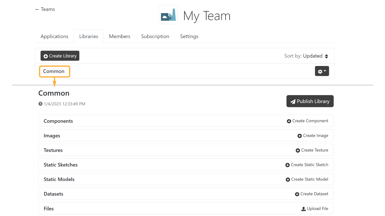
How To Use
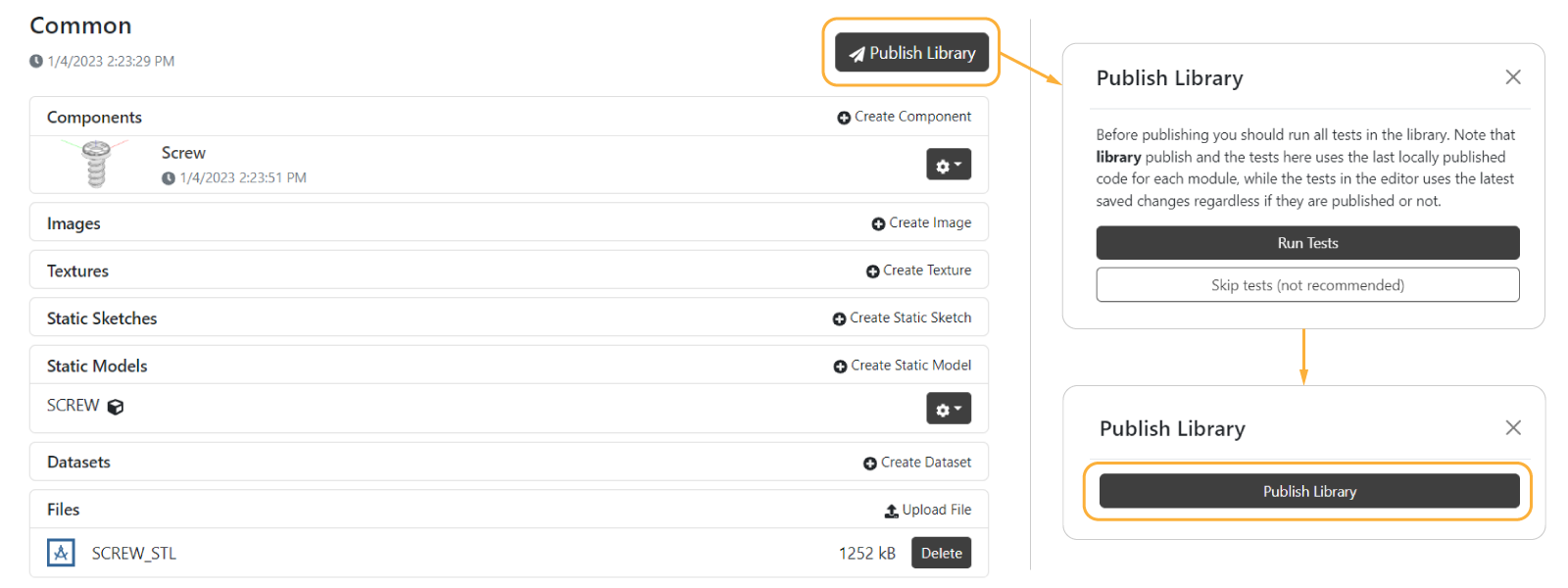
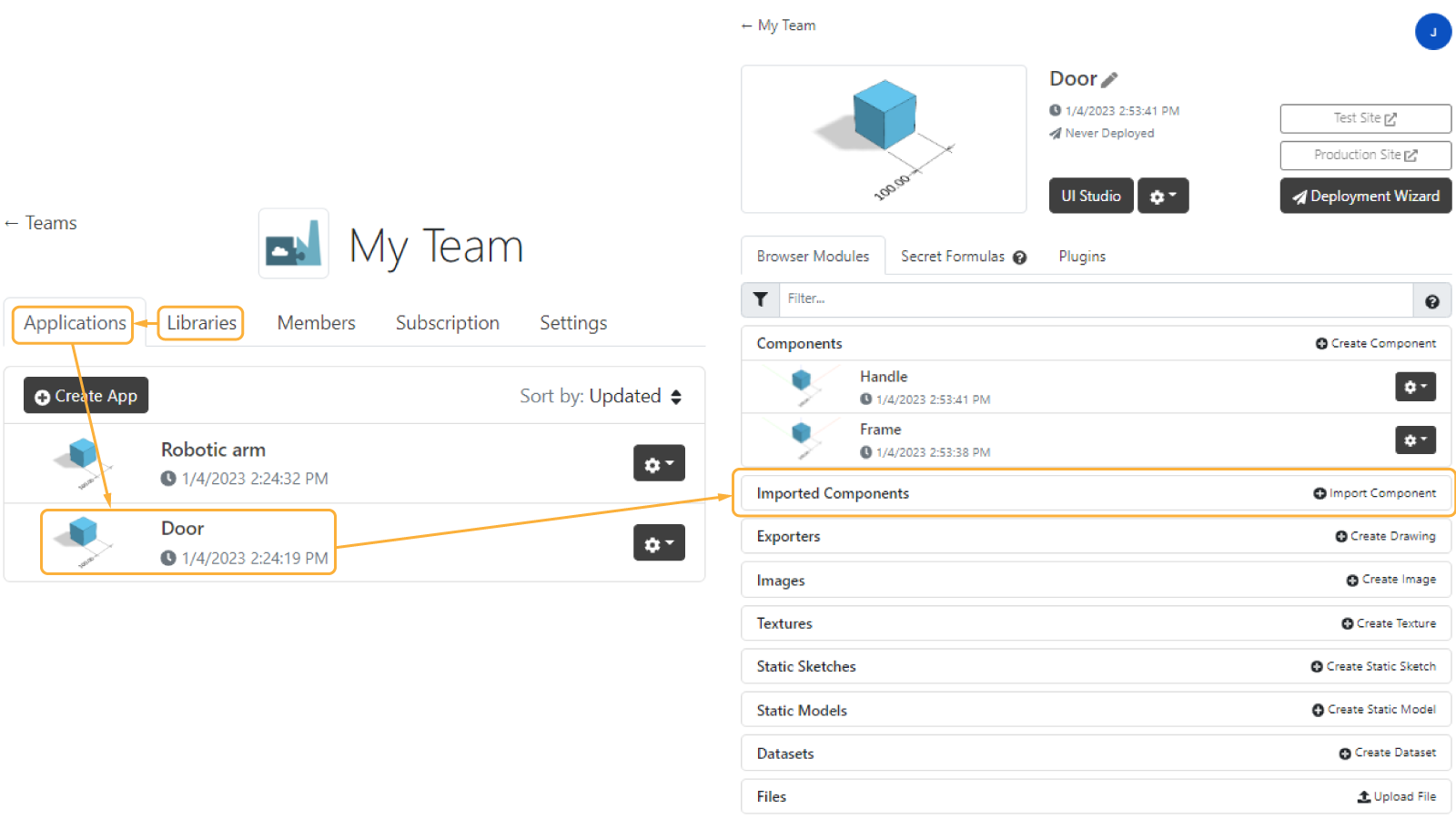
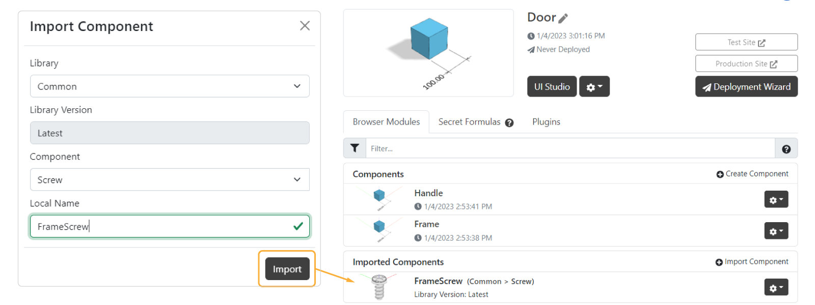
You can create all the libraries you need depending on the level of complexity you consider. To show a simple example, let's create a library called Common that will contain a component Screw which uses a static asset for its model. Now in order to use this component we would need to:
- Publish the component as usual (explained here)
- Publish the library so that all the latest versions of the components are available to use:
- Back into your applications, go into one of them and import it as a Imported component:
- If you publish the library correctly, you should see it in the dropdown. You can give the same name to the imported
component or use a different local name depending on the application for better reference.
- Once the imported component is in your app dashboard, simply use it in other components, drawings and UI as if it was a regular component, accessing via show/hide imports... at the top of any code editor (as shown above here).
See that it also gives information about the version of the library in case you update the Screw component but forgot to publish your library. Notice also that the imported component shows extra information about from which library it comes from and if it's using the latest version of the library.
Configuration Info
You can see the information regarding your configuration by using the following in UI of the app, which contains:
idthat is unique for all the configurations saved in the app.isUnsavedas a boolean to check if the configuration has been saved previously or not.namegiven when saving the configurationrevisionas the saved version of the configuration (starting in0). E.g. a configuration saved 3 times will haverevision: 3.
const configurationInfo = Studio.getConfigurationInfo() // returns { id: string, isUnsaved: boolean, name: string, revision: number }
The most common example of use of this can be found in the drawing, e.g. to show the name and revision in the
header. Also remember that you can access the previous versions of saved configurations through the URL, read more about
it here.
Scene Settings
The editor tab EXPORTS can be found in the UI of your application. Besides what's needed to run the app, you
can find some scene settings in the predefined function productConfigurationFactory():
export function productConfigurationFactory(): STUDIO.IProductConfiguration {
  return {
    // Scene
    sceneOptions: {
      type: 'room',
      ambientIntensity: 1,
      lightIntensity: 1,
      lightRotation: 0,
      clearColor: 0xffffff,

      // type: 'outdoor',
      // ambientIntensity: 1,
      // sunIntensity: 1,
      // sunPosition: new SKYMATH.Vector3D(1000, -1000, 1000),
      // clearColor: 0xffffff,
      // subjectSize: 1000,
      // shadowMapSize: 1000,
    },

    // Others
    showEdges: true,
    disableLoadingEffectOnGeometryUpdate: true,
    ui: {
      disableTabCollapse: true,
      animatedModals: true,
    },
    useSelectiveGeometryInteraction: true,

    // Do not remove these 3:
    generator: ProductGenerator,
    componentIdMappings: getComponentIdMappings(),
    textures: getTextureReferences(),
  }
}
In here you will find about:
- scene options like
roomandoutdoor. - others like 3D edges, loading effects and more UI-related.
- environment mapping to support HDRI.
sceneOptions
sceneOptionswith the alternatives:-
roomwith multiple light sources but no shadow-casting, with these options:
a)ambientIntensityandlightIntensity, whose combination can achieve different results: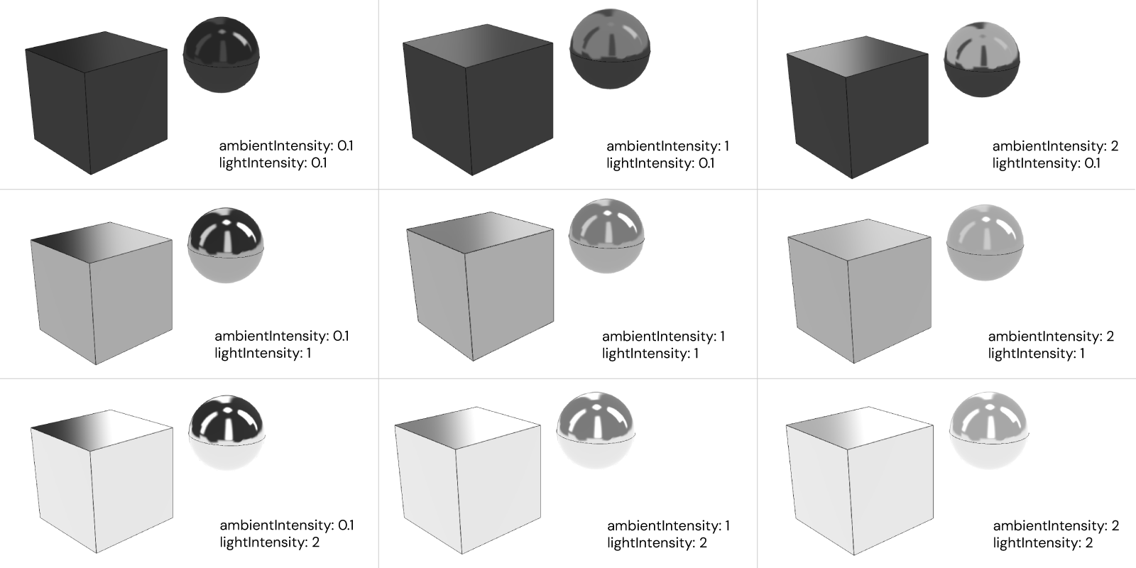
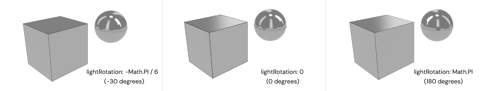
b)lightRotationin radians to rotate the lighting:
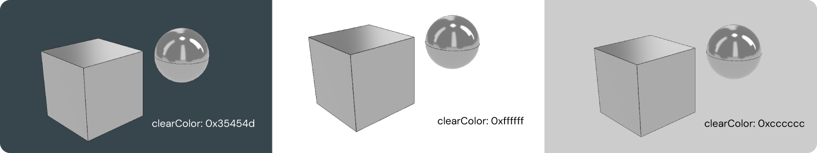
c)clearColorin hexadecimal code to change the background color:
-
outdoorwith 1 light source and shadow-casting, with these options:
a)ambientIntensityandsunIntensity, whose combination can achieve different results:

b)sunPositionasSKYCAD.Vector3Dto determine the only light source position and thus the shadow directions:

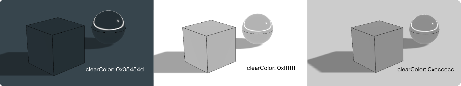
c)clearColorin hexadecimal code to change the background and light color affecting the material appearances:
c)subjectSizeto adjust manually the shadows to the subject (undefinedwill find the most suitable shadow size):

d)shadowMapSizeto adjust the blurriness/sharpness of the shadows.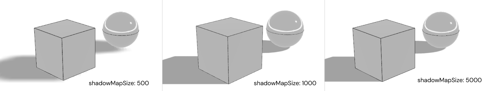 tip
tipCasting shadows generally takes much higher computational time - this is why
roomis preferable overoutdoor.
-
Others
-
showEdgesto show/hide the edges of the model.

-
disableLoadingEffectOnGeometryUpdate: to disable/enable the loading effect when the geometry updates:true(left in video below) to disable the blur effect between geometry updates (recommended for light/fast geometries).false(right in video below) to enable the blur effect between geomrtry updates (recommended for heavy/slow geometries).
UI tabs & modals
uiwith:disableTabCollapseto disable/enable theSKYUI.Tabto be collapsible when clicking on it.animatedModalsto disable/enable modals animation, i.e. iffalsethey show up instantly.
Environment Mapping (HDRI)
The reflection or environment mapping is an efficient lighting technique that allows reflections on the object surfaces more cheaply with little loss of accuracy compared to other expensive ones like ray tracing. This is achieved with a high dynamic range image or HDRI that acts as a 3D surface surrounding the object.
In order to use them:
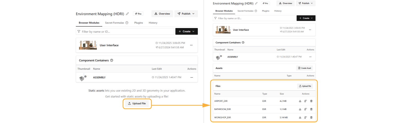
- Get the HDRI in EXR format (you can try downloading any of these: Workshop (.exr), Airport (.exr), Bathroom (.exr))
- In your app dashboard, upload your EXR file to your app under Upload File
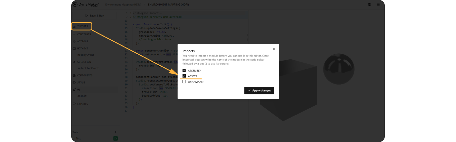
- Once uploaded successfully, step into the UI editor and import ASSETS as usual:
- Finally in EXPORTS, in
productConfigurationFactory(), withinsceneOptionsuseenvironmentMapUrl: ASSETS.URLS.WORKSHOP_EXRto enable it.
export function productConfigurationFactory(): STUDIO.IProductConfiguration {
  return {
    sceneOptions: {
      type: 'room',
      environmentMapUrl: ASSETS.URLS.WORKSHOP_EXR,
      // showEnvironmentBackground: true,
      // environmentBackgroundBlurriness: 0.07,
      // lightIntensity: 2,
      // ambientIntensity: 0.5
    },

    // ... rest of settings
  }
}
With an HDRI in place, try changing lightIntensity, ambientIntensity and lightRotation to tweak the lighting
setup.
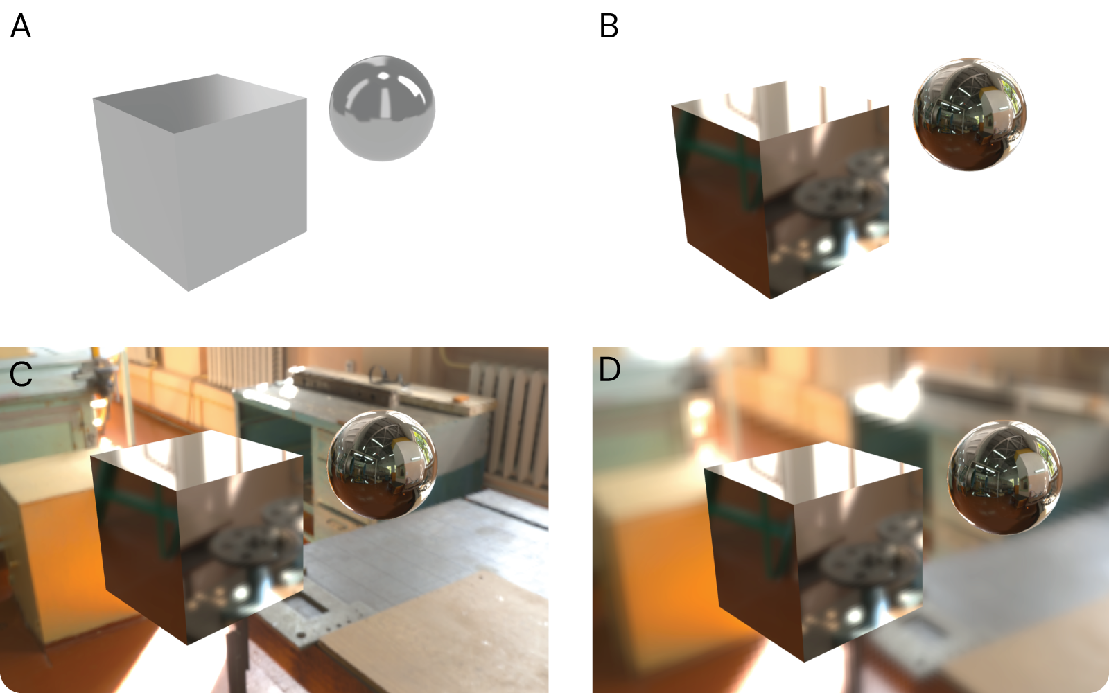
In the picture below we show 4 different scenarios:
- A: default HDRI
- B: custom HDRI but hidden (
showEnvironmentBackground: false) - recommended to use! - C: custom HDRI shown (
showEnvironmentBackground: true) - D: custom HDRI with blurriness (
environmentBackgroundBlurriness: 0.07)
Try rotating the camera and see the effects of lighting and reflection on the cube's and sphere's surfaces:
See that the objects might appear as they are "floating" in the air. You can trick the user by adding the objects on
some sort of static object, like almost-infinite ground if you use an outdoor HDRI with a skyline or even a simple table
for the case of this workshop. Limiting the camera angle (maxPolarAngle: Math.PI/2 - see
How to move camera) so that the user is not allowed to see e.g. under ground or behind a wall that
the object is attached to usually helps with the immersion. Depending on the desired result, sometimes showEdges: true
helps to see what should be configurable when enabled, although showEdges: false might make blend the objects with the
environment better. It's up to you!
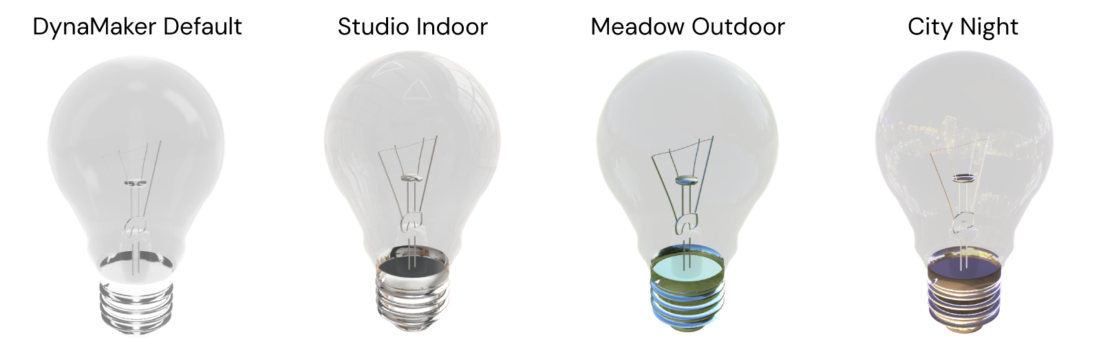
Notice that each HDRI comes with its own light sources and colors, so the true colors of your models might look different under certain HDRIs. In the lightbulb example below, notice how the metallic bottom cap changes depending on the HDRI applied.
If you would like to explore the other available optional arguments or need help understanding them reach us at support@dynamaker.com.