CSS
In DynaMaker it is possible to customize the appearance of the UI of the app by overwriting its Cascading Style Sheets (or CSS), which is a stylesheet language used to describe the presentation of a document written in HTML or XML. This is done in the tab STYLE of the UI.
Remember that any default behavior built in the DynaMaker UI will be overwritten by your code.
You can read more about CSS in https://developer.mozilla.org/en-US/docs/Web/CSS
Here we present some of the most common examples that can be useful for your application regarding:
Tabs
Hide Menu
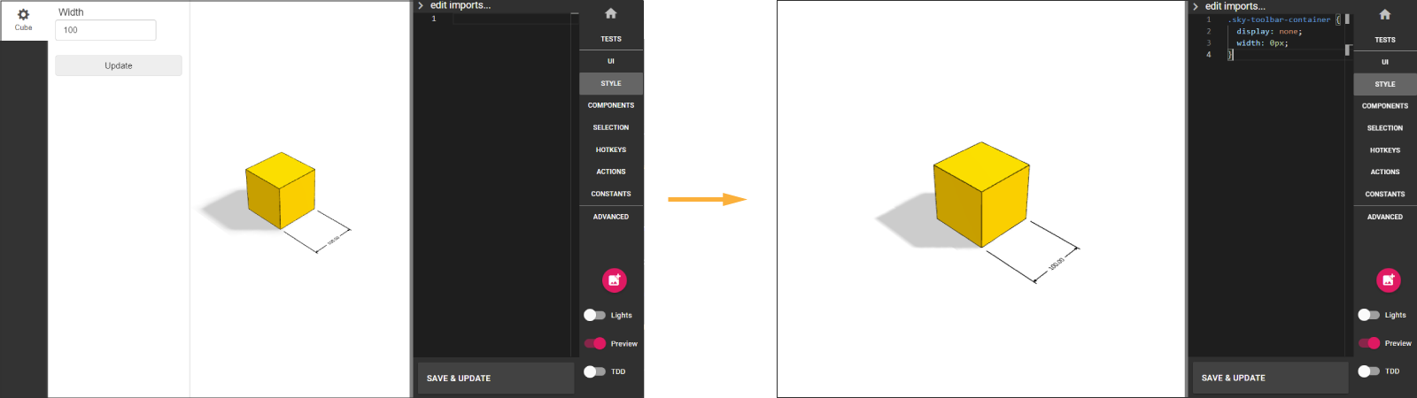
Typically when using plugins in DynaMaker (like Elfsquad), the data of the configuration is already handled by the plugin. Therefore, there might be no need to add tabs with buttons in the configurator. Simply hide the whole menu with the following:
.sky-toolbar-container {
  display: none;
}
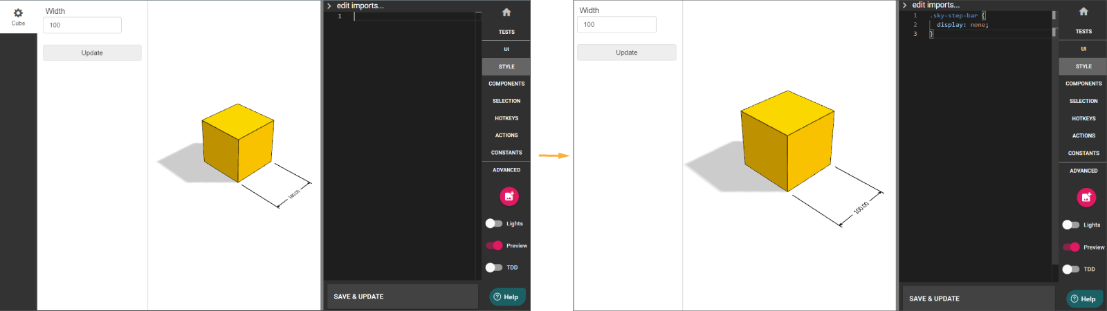
Hide Tabs
Useful when you have everything (buttons, configurators, etc) in one tab, you might want to hide the only existing tab since it adds no value to the app or its UX. You can hide the tabs column with:
.sky-step-bar {
  display: none;
}
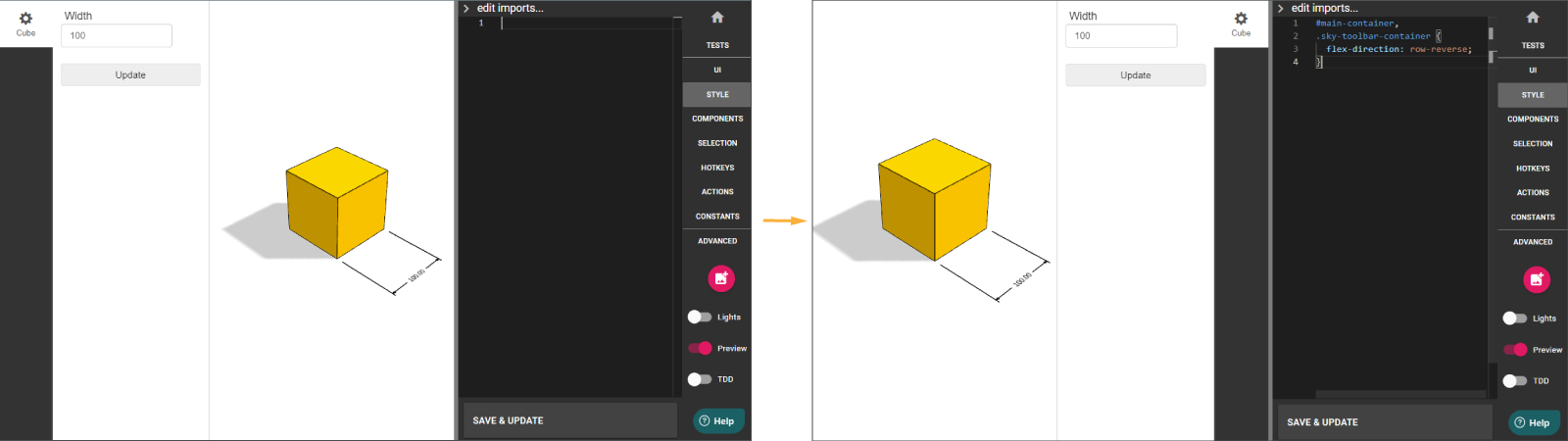
Move Menu To The Right
#main-container,
.sky-toolbar-container {
  flex-direction: row-reverse;
}
Make Tabs With Long Names Higher
Long names in SKYUI.Tab that can be split into two rows might need more height to fit. You can adjust the margin (or
padding) by setting the pixels needed for the tab with the following CSS:
.sky-step-bar > ul > li > a {
  padding: 15px 0px;
}
Add Space At Top
.sky-toolbar {
  padding-top: 20px;
}
Buttons
Make Buttons With Long Names Higher
Long names in SKYUI.Button that can be split into multiple rows might need a responsive height to fit. You can use the
following

.sky-toolbar sky-button span {
  white-space: normal;
}
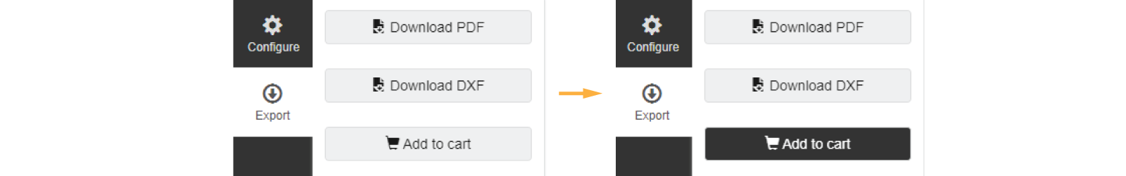
Change Color
In order to change the color of a specific button, start by giving a bootstrapType, like:
const addToCartButton = new SKYUI.Button('Add to cart', () => {}, {
  icon: 'shopping-cart',
  bootstrapType: 'btn-primary add-to-cart-button',
})
Then in STYLE you can customize its style as:
.add-to-cart-button {
  background-color: #7393b3;
  color: #ffffff;
}
Quickbar
Adjust Height
Useful when you have custom images instead of the predefined icons in your (quickbar items)[library-studio#quickbar-items]. The default height is set to 40 px but you can change that number with:
.sky-quick-bar-item-container img {
  max-height: 50px;
}
Adjust Width
You can adjust the width of the quickbar so it fits a certain number of items. Depending on their size, or if they have icons or images, you might want to adjust the width so it fits however you consider:
.sky-quick-bar {
  width: 250px;
}
Alternatively you can also try:
.sky-quick-bar {
  width: fit-content;
}
UI Layout
Fullscreen Button
Typically used when your DynaMaker app is in a small iframe that can be enlarged for a better UX.
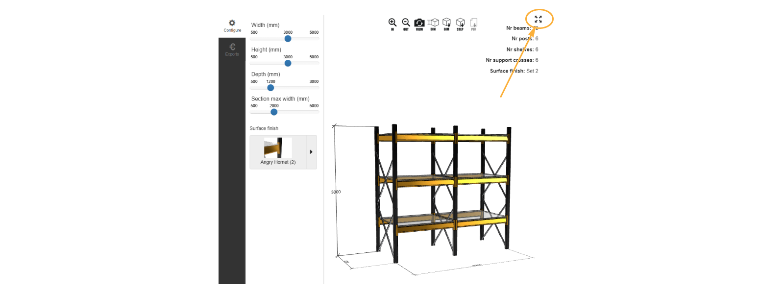
- Create function
addFullscreenButtonin ACTIONS:
export function addFullscreenButton() {
  const span = document.createElement('span')
  const container = document.getElementById('container-studio')
  if (!container) return
  span.className = 'fullscreen-button glyphicon glyphicon-fullscreen'
  span.onclick = () => (document.fullscreenElement ? document.exitFullscreen() : container.requestFullscreen())
  container.appendChild(span)
}
- Adjust appearance and location of this
fullscreen-buttonin STYLE:
.fullscreen-button {
  position: fixed;
  top: 5px; /* change to 'bottom' for bottom placement */
  right: 5px; /* change to 'left' for left placement */
  font-size: 20px;
  cursor: pointer;
  z-index: 9999;
}
- Run
addFullscreenButtonwithinonInitin UI:
export function onInit() {
  ACTIONS.addFullscreenButton()
  // rest of functions
}
Mobile Layout
This snippet changes the layout of the UI when the width of the screen is below 600 pixels to have the canvas/scene at the top of the screen and the toolbar below. Use it as is, or as a starting point for your responsive requirements.
@media only screen and (max-width: 600px) {
  #main-container {
    flex-direction: column;
  }

  #container-canvas {
    flex-grow: 1;
    height: 33%;
  }

  .sky-toolbar-container {
    flex-direction: column;
    flex-grow: 1;
    height: 67%;
    order: 1;
    width: 100%;
  }

  .sky-toolbar {
    width: 100%;
  }

  .sky-step-bar > ul {
    display: flex;
    overflow: unset;
  }

  .sky-step-bar > ul > li {
    z-index: unset;
  }

  .sky-quick-bar {
    width: unset;
  }
}
Add Image
You can add any image from ASSETS easily by creating some HTML elements and adjusting its style in STYLE through CSS.
The following example uses the DynaMaker logo and place it on the bottom-left corner of the canvas.
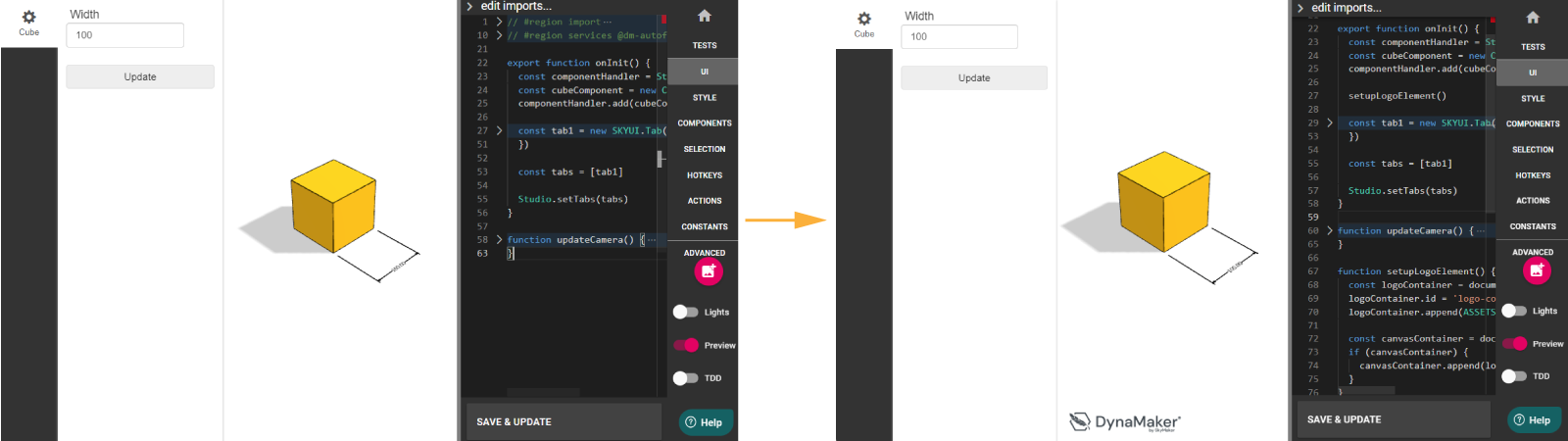
For this:
- In UI, create
setupLogoElement()with a proper naming:
export function onInit() {
  setupLogoElement()

  const componentHandler = Studio.getComponentHandler()
  const cubeComponent = new CUBE.Component()
  componentHandler.add(cubeComponent)
  Studio.requestGeometry()

  const tab1 = new SKYUI.Tab({
    /**/
  })
  const tabs = [tab1]

  Studio.setTabs(tabs)
}

function setupLogoElement() {
  const logoContainer = document.createElement('div')
  logoContainer.id = 'logo-container'
  logoContainer.append(ASSETS.IMAGES.DYNAMAKER_LOGO)

  const canvasContainer = document.getElementById('container-canvas')
  if (canvasContainer) {
    canvasContainer.append(logoContainer)
  }
}
- In STYLE, adjust the location and size of the image according to the name given in UI:
#logo-container {
  bottom: 10px;
  height: 40px;
  left: 10px;
  pointer-events: none;
  position: absolute;
}

#logo-container img {
  height: 100%;
  width: auto;
}
Change UI Font
If you would like to change the default font of the UI for your own, you can try the following example:
body {
  font-family: 'Times New Roman', Times, serif;
}
If you want to load a font from an external service, like Google Fonts, you can do that like this:
@import url(//fonts.googleapis.com/css?family=Open+Sans);
body {
  font-family: 'Open Sans', sans-serif;
}
To use a .ttf that you uploaded to the DynaMaker Dashboard, you can load it from your TypeScript code:
const font = new FontFace('My Custom Font', `url(${ASSETS.URLS.MY_CUSTOM_FONT_TTF})`)
await font.load()
document.fonts.add(font)
Then you can use the font, either from TypeScript like this:
document.body.style.fontFamily = 'My Custom Font'
Or from CSS in the STYLE tab like this:
body {
  font-family: 'My Custom Font';
}
Extra canvas
You can add a SKYCAD.Layout on the UI as an additional canvas placed on top of the default visualization.
The following example shows a canvas with a SKYCAD.Layout that contains a circle cut due to its location on the
canvas:
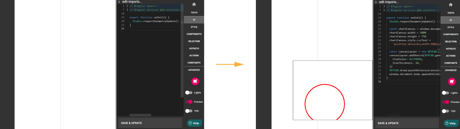
export function onInit() {
  Studio.requestGeometryUpdate() // so it doesn't load forever since it's empty

  const chartCanvas = window.document.createElement('canvas')
  chartCanvas.width = 1000
  chartCanvas.height = 750
  chartCanvas.style.cssText =
    'position:absolute;width:400px;border:1px #000 solid;height:300;opacity:1;z-index:100;background:#fff; right:0; bottom: 50px'

  const canvasLayout = new SKYCAD.Layout()
  canvasLayout.addSketch(SKYCAD.generateCircleSketch(400, 200, 500), {
    lineColor: 0xff0000,
    lineThickness: 10,
  })
  SKYCAD.drawLayoutOnCanvas(canvasLayout, chartCanvas, { scale: 1 })
  window.document.body.appendChild(chartCanvas)
}
Notice that location, size and style can be changed through CSS as usual. See also that the layout can be dependent on any property, component, etc, so you can have any dynamic behavior on it.
Parameters
Dropdown With Images
In order to change the style of the dropdown, you can start by giving it a className (e.g. 'dropdown-image):
const dropdownParameter = SKYPARAM.generateDropdown(
  PARAMETER_ID.MATERIAL,
  'Material',
  [
    new SKYPARAM.DropdownItem('Linen', CONSTANTS.MATERIAL.LINEN, {
      thumbnail: ASSETS.URLS.LINEN_JPG,
    }),
    new SKYPARAM.DropdownItem('Cotton', CONSTANTS.MATERIAL.COTTON, {
      thumbnail: ASSETS.URLS.COTTON_JPG,
    }),
    new SKYPARAM.DropdownItem('Lycra', CONSTANTS.MATERIAL.LYCRA, {
      thumbnail: ASSETS.URLS.LYCRA_JPG,
    }),
  ],
  {
    defaultValue: material,
    showOptionThumbnails: true,
    className: 'dropdown-image',
  },
)
Then you point to it in CSS easily like the following to e.g. center-align the text:
.dropdown-image a {
  text-align: center;
  /* border: 1px #ccc solid; */
  padding: 8px;
  margin-bottom: 5px;
}
Shorten Input Fields
Sometimes when you have long units in SKYPARAM.generateInputParameter they might overflow the current UI or even go to
a second row by default. You can adjust the width of the field of an input parameter with the following (in percentage):
.sky-toolbar .parameter-input .parameter-input-field {
  width: 72%;
}
Touch devices
Avoid Zooming Of Page
Usually when your DynaMaker application lies in a webpage as an iframe, zooming into the visualization might result into zooming into the website as well. In order to avoid this you can simply have the following snippet:
body {
  touch-action: none;
}
Would you like to contribute with other CSS snippets or request new ones? Reach us at support@dynamaker.com and help the community to code faster!